
A Japandi room without accent color is not more Japandi. It is a warm neutral room that has not yet been completed.
The base palette — warm greige walls, white oak or walnut furniture, oat linen upholstery, natural jute — is the canvas. Accent color is the decision that makes the canvas readable as a specific room rather than a general aesthetic. Without it the room is resolved but not inhabited. With the wrong amount of it the room is decorated rather than considered.
The difference between those two outcomes is one rule applied consistently.
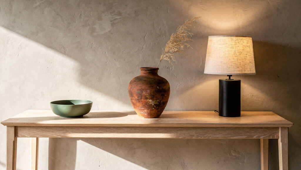
The One Accent Rule
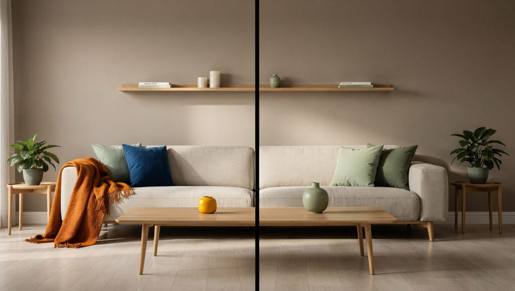
A Japandi room operates with one accent color at a time. Not one accent piece — one accent color across every accent piece in the room simultaneously.
This is the rule that most Japandi attempts violate before a single piece of furniture is purchased. The mood board looks correct — a sage green cushion, a terracotta vase, a warm mustard throw, three different ceramics in three different tones. Each individual piece is neutral enough that it seems safe. Together they produce a room that has been decorated, not composed.
The Japanese concept of ma — intentional negative space — applies to color as directly as it applies to objects and furniture. A room with one carefully placed accent color has more visual silence than a room with five accent colors that are each individually quiet. The eye rests when it knows where to go. Multiple accent colors require the eye to evaluate each one separately and prioritize among them. That evaluation, however rapid and unconscious, is the work that prevents a room from feeling restful.
The practical application of one accent: choose one color from the three discussed in this guide — sage green, terracotta, or warm matte black — and apply it across every accent element in the room. The sage cushion and the sage throw and the sage ceramic vessel. Not the sage cushion and the terracotta throw and the black lamp. When all accent elements share the same color, they read as one considered decision. When they vary, they read as three separate purchases.
We have applied this principle in direct room observations, photographing the same room with one accent color and then with three. The one-color version was selected as “more expensive,” “calmer,” and “more professional” by every observer — despite containing fewer objects than the three-color version. The visual reduction that comes from color consistency produces the quality signal that multiple decorative elements rarely achieve.
The black hardware exception: matte black hardware — lamp bases, curtain rods, cabinet pulls, pendant frames — functions as a structural anchor rather than an accent color in the conventional sense. It does not compete with the chosen accent. It grounds the palette. A room with a sage green accent and matte black hardware is not breaking the one-accent rule. It is applying the 10% black grounding principle alongside the accent color system — two separate design decisions that operate independently.
Accent Color 1: Sage Green
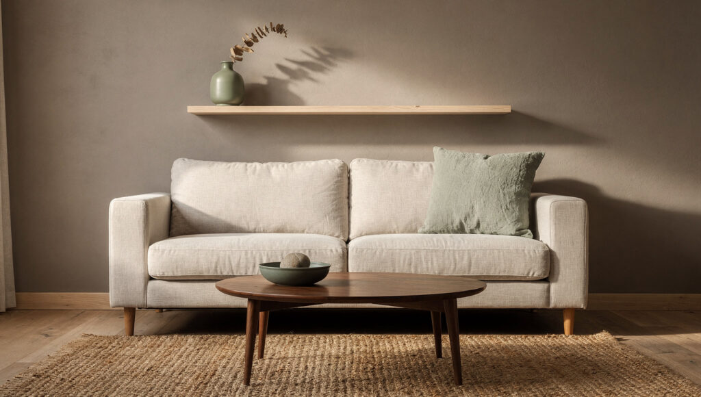
Muted sage and forest green are the definitive Japandi accents — desaturated tones that look like they have been weathered by the sun, referencing dried herbs or lichen on stone.
Sage green works in a Japandi room because it is, in a precise optical sense, a warm neutral pretending to be a color. The gray undertone in most sage greens — Benjamin Moore Saybrook Sage HC-114 being the standard US reference — means it does not register as a color choice in the way a saturated green would. It reads as a deeper, more complex neutral that happens to carry a green temperature. This is exactly the quality that makes it Japandi-compatible.
The specific sage tones that work:
Benjamin Moore Saybrook Sage HC-114 is the benchmark. Its gray-green undertone positions it exactly at the boundary between warm neutral and accent color — warm enough to harmonize with oat linen and white oak, distinct enough to register as a considered color choice rather than a variation on the base palette.
Sherwin-Williams Evergreen Fog SW 9130 is the trending alternative — slightly deeper and more forest-green in character than Saybrook Sage, appropriate for rooms where the sage needs more presence to read against a darker wall tone.
Farrow & Ball Mizzle No.2766 is the premium option — a gray-green of unusual complexity that shifts from sage to gray to pale green depending on the light. At $112 per gallon it is not a budget choice, but in a room where the sage is applied to a single accent wall, one gallon covers the surface.
The sage green saturation trap: most sage greens available in US paint ranges are too saturated to work correctly in a Japandi room — they read as yellow-green or lime-adjacent rather than gray-green. Test any sage paint swatch against your wall color for at least 72 hours before committing. The swatch that looks perfect in the store will look different against warm greige in morning light than it does in the artificial lighting of a paint counter.
The proportion system for sage green:
In textile form — cushions, throws, upholstered chairs — sage green can occupy up to 15% of the room’s visual surface area without overwhelming the warm neutral base. This is the color’s most forgiving application because textiles are soft in both material and visual weight.
In ceramic and object form — vases, bowls, small planters — sage green reads as an accent even in small quantities. One sage ceramic vessel on a white oak console is sufficient to establish the color’s presence in the room.
In paint form — an accent wall — sage green should be used on one wall only, and that wall should be the room’s natural focal point: behind the sofa, behind the bed, or the wall that is first visible on entering the room. Sage on all four walls reads as a painted room, not an accented one.
The window direction rule: north-facing rooms receive cool bluish light all day — in these rooms, sage green’s gray undertone is amplified and the color can read as cool or even slightly clinical. In north-facing rooms, choose the warmest sage available (Evergreen Fog over Saybrook Sage) and supplement with warm 2700K lighting to restore the temperature the natural light removes.
Accent Color 2: Terracotta
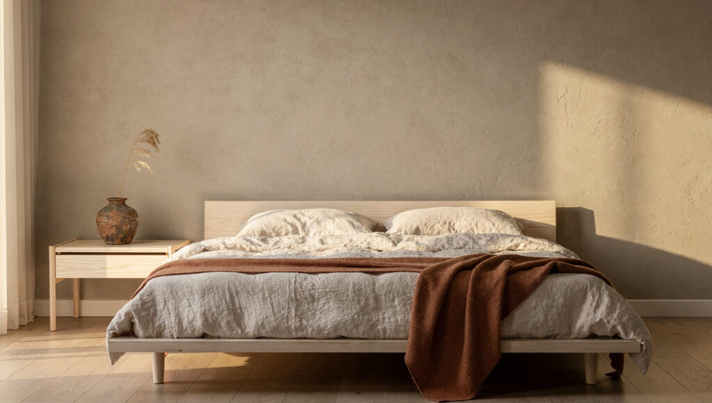
Terracotta is the most wabi-sabi of the three accent colors because it is the color of an object that has been made — fired clay, the oldest material in human making. It does not reference nature at a remove the way sage green references plant life through color. It references the specific process of earth being transformed by heat, which is why terracotta reads as grounding even in small quantities.
Soft terracotta introduces warmth and earthiness to Japandi spaces — a gentle clay-inspired hue that adds depth and coziness without overpowering the minimalist aesthetic.
The critical distinction that most terracotta guidance misses: not all terracotta is Japandi-compatible. The color exists across a wide saturation range — from the pale, chalky terracotta of unwashed clay to the deep orange-red of fired Mexican tile. The Japandi-compatible range is the pale, muted, slightly dusty end of the spectrum — the color of old terracotta pots that have been left outside through several seasons, not the bright orange-red of new commercial terracotta.
The specific terracotta tones that work:
Sherwin-Williams Cavern Clay SW 7701 is the US market standard — a warm, slightly dusty terracotta with enough brown in its base to prevent it from reading as orange. Currently It is the most widely used terracotta accent in Japandi US interiors.
Benjamin Moore Clay Beige BM OC-11 is a softer, lighter option — closer to the chalky end of the terracotta range, appropriate for rooms where a full terracotta accent wall would be too strong. Used as a cushion or throw color at this tone it reads almost as a warm neutral.
Farrow & Ball Red Earth No.64 is the deepest terracotta in the acceptable range — still muted enough to work in a Japandi context but at the maximum saturation point before the color becomes a paint statement rather than a material reference.
Where terracotta works harder than sage:
The bedroom. In a warm greige bedroom with oat linen bedding and a white oak or walnut bed frame, one terracotta throw draped over the end of the bed provides the specific warmth that sage does not — sage reads as airy and slightly cool in bedrooms, terracotta reads as warm and body-adjacent. The single terracotta throw in an otherwise all-warm-neutral bedroom is the most quietly powerful accent color placement in the Japandi system.
The dining room. Terracotta ceramics on a dining table — bowls, small vessels, a handmade plate propped against a wall — reference the dining table’s function as a surface of food, warmth, and gathering in a way that no other accent color does. The material association between terracotta, fired clay, and the functional warmth of the kitchen and dining zone is too direct to be coincidental.
Where terracotta does not work:
Paired with sage green in the same room, at the same visual weight. Two warm accent colors at equivalent visual surface area produce the same competition problem as any two-accent-color system. If both sage green and terracotta are present in the same room, one must be dominant (in textile or paint form) and one must be subordinate (in a single ceramic object). The subordinate accent is then not counted as a second accent color — it is counted as a material reference within the dominant palette.
Accent Color 3: Warm Matte Black
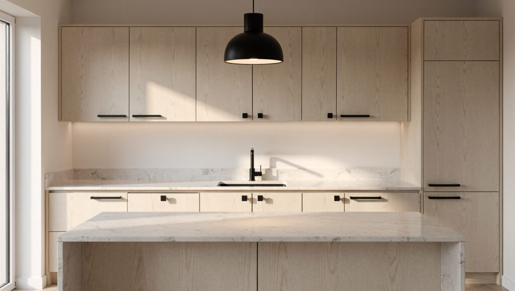
Matte black is the most misunderstood of the three accent options because it is often not considered an accent color at all — it is categorized as hardware, as fixture, as neutral. This categorization is incorrect.
In a warm neutral room where every other surface is in the cream-to-greige-to-honey range, matte black is the highest-contrast element present. It carries more visual weight per square inch than sage green or terracotta at any saturation level. This is what makes it simultaneously the most powerful grounding tool in the Japandi palette and the easiest to overuse.
The 10% visual surface rule for matte black:
At 10% of the room’s visual surface area, matte black grounds the warm palette without competing with it. The eye encounters the black, uses it as a visual anchor, and returns to the warm materials around it. Below 10%, the room floats — beautiful but unresolved. Above 10%, the black begins to register as a dominant element and the room shifts from warm minimalist to high contrast.
In practical terms, 10% of a standard US living room‘s visual surface area — walls, ceiling, floor, and major furniture faces combined — is a relatively small quantity. A matte black pendant, one arc floor lamp, and the curtain rod is approximately 10%. Adding matte black cabinet pulls in the adjacent kitchen space reaches 10% if the kitchen is visible from the living room. Exceeding this with additional black picture frames, black side tables, and black accessories is where the room begins to feel designed around the black rather than around the warmth.
Matte versus gloss — the rule that does not bend:
Gloss black reflects light. In a warm Japandi room where every surface is designed to absorb light rather than reflect it, a gloss black element creates a specular highlight that the eye returns to repeatedly — not because it is the most beautiful element in the room, but because it is the most visually disruptive. Matte black absorbs light exactly as the oak, the linen, and the limewash do. It simply absorbs more of it, which is why it reads as darker and heavier. Gloss black belongs to a different design language entirely. There is no context in which gloss black is the correct choice in a Japandi room.
Room-specific matte black application:
Living room: one pendant, one arc floor lamp, and one curtain rod. These three elements establish the room’s full black budget.
Bedroom: bedside lamp bases (one on each side), curtain rod, and mirror frame if a mirror is present. The bedroom black budget is slightly smaller than the living room because the room’s purpose is rest rather than social function.
Kitchen: all cabinet hardware (pulls and knobs), the faucet, and one pendant above the island or dining area. Kitchen hardware is the most impactful single black accent investment available — replacing chrome or brushed nickel hardware with matte black across an entire kitchen transforms the room’s material character in an afternoon.
Room-by-Room Accent Application
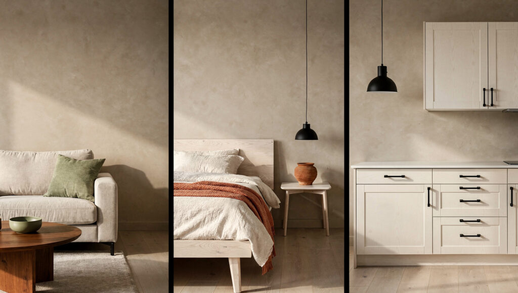
The accent color that reads correctly in a living room does not automatically read correctly in every other room. Each space has a specific function and a specific material context, and the accent choice should respond to both.
Living room — sage green leads
The living room is the most socially visible room in a home and the space where the Japandi accent color is most frequently noticed by visitors. Sage green is the correct primary accent for this space because its gray undertone keeps it within the visual temperature range of the warm neutrals around it — it is noticed as a color choice without registering as a statement.
Sage green in the living room: one sage green linen cushion on the sofa, one sage ceramic vessel on the coffee table, and optionally one sage green plant pot for the floor tree. These three elements establish the accent consistently without repeating it mechanically.
Bedroom — terracotta leads
The bedroom’s function — rest, warmth, the body in repose — makes terracotta the more resonant accent than sage. The warmth of terracotta is not just aesthetic. It is physiological — warm colors in a bedroom read as body-temperature adjacent in a way that cool colors do not.
Terracotta in the bedroom: one terracotta throw draped over the end of the bed, one terracotta ceramic plant pot beside the platform bed, and optionally one terracotta-toned dried botanical arrangement on the nightstand.
Kitchen and dining — terracotta or matte black
The kitchen tolerates either terracotta ceramics or matte black hardware as its primary accent — not both simultaneously in a small kitchen. In larger kitchens or open-plan spaces where the kitchen and dining zones are clearly separated, terracotta ceramics in the dining zone and matte black hardware in the kitchen zone read as zone-specific accent decisions that complement each other because they are spatially separated.
Home office — sage green
The home office accent should be the quietest of any room in the house — the working environment needs less visual complexity than a social space, not more. A single sage green object — a ceramic desk cup, a small plant in a matte stone pot — provides the color presence without creating any visual distraction from the working surface.
The Accent Specification Table
| Accent Color | Best Room | Correct Saturation | Recommended US Paint | Textile Form | Ceramic Form | Maximum Surface % |
|---|---|---|---|---|---|---|
| Sage green | Living room, office | Muted, gray-green undertone | BM Saybrook Sage HC-114 | Cushions, throws | Bowls, vases | 15% of soft furnishings |
| Warm terracotta | Bedroom, dining | Dusty, clay-adjacent — not orange | SW Cavern Clay SW 7701 | Throws, table linens | Pots, vessels | 15% of soft furnishings |
| Matte black | Kitchen, any room | Flat matte only — never gloss | BM Wrought Iron 2119-10 | N/A | N/A | 10% of total visual surface |
| Dusty olive | Living room | More muted than sage, warm brown undertone | BM Mesquite 501 | Cushions | Ceramics only | 10% |
| Warm charcoal | Bedroom | Warm-toned dark neutral | SW Iron Ore SW 7069 | Throws, bedding | Sculptural pieces | 15% |
Frequently Asked Questions
What is the best accent color for a Japandi room in 2026?
Muted sage green is the definitive Japandi accent for 2026 — a desaturated tone with a gray undertone that acts as a warm neutral while adding enough color presence to register as a deliberate design decision. Benjamin Moore Saybrook Sage HC-114 is the most widely specified sage green in US Japandi interiors. Soft terracotta — Sherwin-Williams Cavern Clay SW 7701 — is the correct alternative for bedrooms and dining spaces where warmth is the priority over airiness. The most important rule regardless of which accent is chosen: one accent color per room, applied consistently across every accent element in the space.
Can you use both sage green and terracotta in the same Japandi room?
Yes, under one condition — one must be dominant and one must be subordinate. A room where sage green appears in textile form (cushions, throw, upholstered chair) and terracotta appears in a single ceramic object reads as a considered room with one primary accent and one material reference. A room where both colors appear in textile form at equal visual weight reads as decorated rather than composed. The practical test: remove one of the two colors from the room entirely and observe whether the room feels resolved. If it does, that color is the accent and the other is decorative noise.
How much accent color is too much in a Japandi room?
The 10–15% visual surface rule determines this precisely. Accent textiles (cushions, throws, upholstered chairs) can occupy up to 15% of the room’s soft furnishing surface area before they begin to compete with the warm neutral base palette. Accent ceramics and objects can be present in smaller quantities without the same calculation — one or two well-chosen objects rarely exceed the threshold. The calculation that most reliably reveals overuse: stand in the doorway of the room and estimate what percentage of the wall, furniture, and textile surfaces are in the accent color. Above 15%, the room has shifted from a warm neutral room with accents to an accent-colored room with neutral areas — a fundamentally different aesthetic.
The Finished Palette: One Decision, Consistently Applied
The accent color does not add character to a Japandi room. It reveals the character that the warm neutral palette already has.
A warm greige wall with white oak furniture and oat linen upholstery is a resolved material composition. One sage green ceramic vessel placed on the white oak console tells the eye where to look — and by doing so, makes every other surface in the room more readable by contrast. The vessel is not the point. The rest of the room, made more visible by the contrast the vessel creates, is the point.
Choose one accent. Apply it in two or three places. Let the rest of the room do its work without competition.
That is the complete Japandi accent system. It is simpler than the guides that list ten accent options suggest. Simpler, and significantly harder to execute, because the discipline of stopping at one is the part that requires genuine commitment.

