Table of Contents
Open any high-end Japandi interior on Pinterest and you will notice something immediately. The room is calm. Not empty—calm. The colors are doing something specific that most people cannot quite name, but they feel it the moment they step into the space.
What they are responding to is not a single color, but a calculated relationship between tones—warm neutrals that recede, wood tones that anchor, and one or two muted accents that give the eye a place to rest. Get this relationship right, and every piece of furniture and ceramic in the room feels like it belongs. Get it wrong, and even the most expensive pieces look like they arrived from different houses.
This is a framework for 2026—the paint colors, the wood species, and the technical rules that make the entire system work together to create a sanctuary.
Subscribe to Homeoration!
Get decor ideas, room inspirations & seasonal styling tips.
By subscribing you agree to receive emails & accept our Privacy Policy.Why Japandi Color is Different from “Neutral” Decorating
Most people think neutral means beige, white, or gray. They end up with rooms that feel flat, cold, or like a generic hotel lobby. Japandi neutrals are different because they are built entirely on “living” undertones.
Every color in a true Japandi palette has a warm base—usually yellow, green, or soft red. This ensures the room feels alive rather than sterile. Environmental psychologists often point to the “Biophilia Effect,” where our brains naturally relax when surrounded by colors found in the organic world. A cool, blue-based gray wall with white oak furniture looks clinical. But a warm greige wall with that same oak looks like a restorative sanctuary. The furniture hasn’t changed, but the undertone is doing all the heavy lifting.
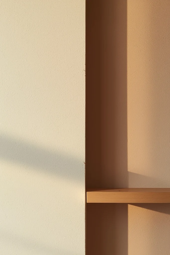
There is also a tonal discipline required here. You aren’t just choosing a color; you are designing a vertical gradient. The goal is to keep the lightest tones on the ceiling, slightly deeper tones on the walls, and the darkest anchors on the floor.
Layer 1: The Base Neutrals (Walls and Large Surfaces)
The base neutrals cover the most surface area and set the emotional volume of the room. In a Japandi palette, these must always be warm, matte, and low-saturation.
When it comes to whites, steer clear of “Bright White.” It is too sharp and makes natural materials like jute or linen look dingy. Instead, look for whites with a soft, aged quality. For US homes, Benjamin Moore White Dove (OC-17) remains the gold standard—it is arguably the most versatile warm white ever made. If your room has heavy south-facing light, Sherwin-Williams Alabaster (SW 7008) is slightly warmer and prevents the space from feeling too “bright.”
If you want more depth, move toward greige—the space where gray and beige meet. Sherwin-Williams Accessible Beige (SW 7036) is virtually foolproof for open-plan living areas. For rooms that are naturally dim or north-facing, Benjamin Moore Revere Pewter (HC-172) adds a sophisticated green-gray depth that holds its own in low light.
Layer 2: Wood Tones (The Structural Warmth)
In a Japandi home, wood functions as the most significant “color” in your palette. It provides the structural warmth that prevents minimalist rooms from feeling vacant.
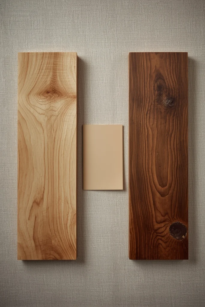
White Oak and Ash are the foundational woods of the aesthetic. They offer a light-to-medium warm tone with a visible grain that perfectly mirrors the “Wabi-Sabi” philosophy of finding beauty in natural textures. For a more premium, anchored feel, Walnut is the superior choice. Its rich brown tones add a sense of permanence, especially when contrasted against a warm white wall like White Dove.
The “Golden Rule” is to match your Wood Temperature to your paint undertone. Warm woods (yellow-toned oak, honey bamboo) go with yellow-undertone paints. Cool-toned woods (gray-washed ash, bleached linen oak) go with gray-undertone paints. To keep the space cohesive, limit yourself to a maximum of two wood species per room.
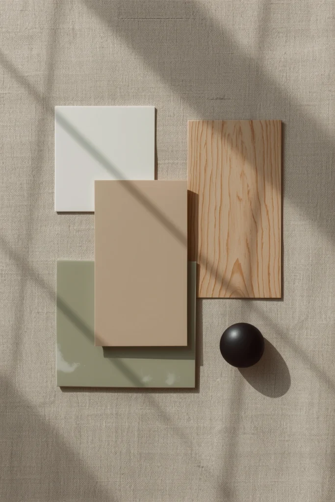
Layer 3: Muted Accents (The Power of 10%)
The goal is to choose one muted accent color per room and apply it to exactly 10% of the visual surface area.
Muted Sage and Forest Green are the definitive Japandi accents for 2026. These are “desaturated” tones that look like they’ve been weathered by the sun—think of the color of dried herbs or lichen on stone. Benjamin Moore Saybrook Sage (HC-114) is a designer favorite because its gray undertone allows it to act as a neutral.
If your room feels too “cool,” introduce Muted Terracotta or Clay. These tones reference the earthiness of Japanese ceramics and bring a grounding warmth to a bedroom or study. Sherwin-Williams Cavern Clay (SW 7701) is a popular choice for an accent wall or a single upholstered chair. Finally, every Japandi palette needs a “Visual Anchor”—a soft black like Benjamin Moore Wrought Iron (2119-10) for hardware, furniture frames, or ceramic vessels.
The Complete 2026 Japandi Palette at a Glance
Benjamin Moore White Dove (Base) + White Oak (Structure) + Sherwin-Williams Accessible Beige (Walls) + Benjamin Moore Saybrook Sage (Accent) + Benjamin Moore Wrought Iron (Anchor). Five elements. One cohesive room.
Japandi Color by Room: The 2026 Application
The Kitchen: Depth and Durability
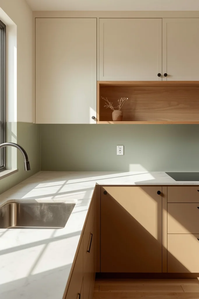
Japandi kitchens are moving toward a more grounded, two-tone approach. Use Soft Contrast: keep upper cabinets in a warm white (like Benjamin Moore White Dove) but use a deeper tone for the lower cabinets. Muted sage or warm greige base units create a “Seamless Harmony.”
For a deep dive into how these colors work alongside functional workspace design, our Japandi Home Office Guide provides the blueprint for balancing organic layers with focused lighting.
The Bedroom: The “Cocoon” Effect
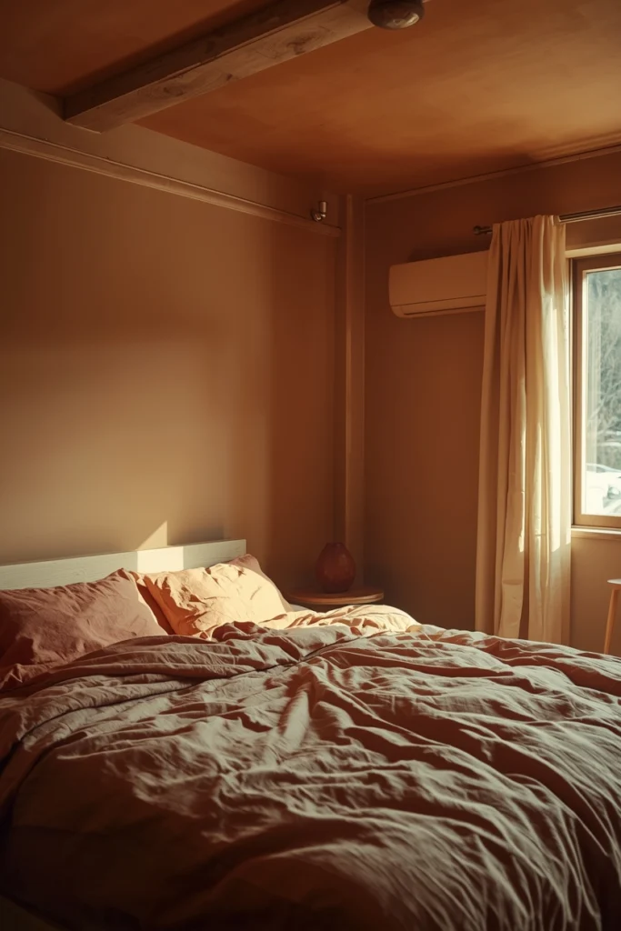
The 2026 trend is Color Drenching—painting walls, trim, and ceilings in the same warm neutral to eliminate harsh visual lines. To break the monotony, use 100% linen bedding in contrasting earthy tones. Parachute Home’s Deep Clay linen or Cultiver’s Sandstone are the closest ready-made options to this tone. The goal is for the room to feel like a “cave-like” sanctuary.
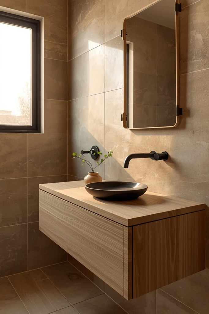
The Bathroom: Spa-Like Grounding
A Japandi bathroom thrives on a Biophilic palette. Start with a white oak vanity and pair it with “stone-look” tiles in a warm greige. For fixtures, move toward Anthracite or Matte Black. Collections like Kohler Artifacts or Moen’s Matte Black series are widely available at Home Depot and deliver this high-end look at mid-range price points.
Five Colors to Never Use in a Japandi Palette
I’ll be honest: my first attempt at a Japandi palette was a disaster. I chose a “cool” gray because it looked great on my screen, but once it hit my walls next to my oak furniture, the whole room looked sickly and yellow. I had to repaint the entire space in White Dove three days later. That mistake taught me the most important lesson in design: the wall and the wood are in a constant conversation, and if they aren’t speaking the same language, the room will never feel calm.
To protect your sanctuary (and your wallet) from the same fate, here are the five specific color choices that will immediately break the aesthetic:
- Cold, Pure Whites: These lack the yellow or red undertones needed to harmonize with wood.
- Cool “Pewter” Grays: Gray is fine, but it must be a Greige. Blue-based grays fight against warm wood tones.
- Saturated Primary Colors: If you can immediately name the color (e.g., “That is Blue”), it is too strong for the Japandi peace.
- Sugary Pastels: Avoid “candy” tones. Look for “dusty” or “chalky” versions with a brown or gray base.
- High-Gloss Finishes: A warm beige in a high-gloss finish reflects too much “visual noise.” Everything should be matte or eggshell.
The Science of Light: How Kelvins Change Your Palette
A common heartbreak in interior design is choosing the perfect warm greige like Accessible Beige, only for it to look “muddy” or “yellow” once it’s on your walls. This is usually not a fault of the paint, but a failure of the lighting.
In a Japandi home, your Color Temperature (measured in Kelvins) is just as important as your paint code. To keep your earthy neutrals looking intentional, you should aim for a “Warm White” light between 2700K and 3000K.
- 2700K (Extra Warm): Ideal for bedrooms and living rooms. It enhances the red and yellow undertones in wood and terracotta, making the room feel like it’s in a permanent “golden hour.”
- 3000K (Warm White): Best for kitchens and bathrooms. it is clean enough to see what you are doing, but warm enough that it won’t turn your White Dove walls blue.
- Avoid 4000K+ (Cool/Daylight): These bulbs are the enemy of Japandi. They cast a blue tint that flattens natural textures and makes your carefully chosen “warm” palette look clinical and cheap.
The Japandi 60-30-10 Rule
To prevent your room from feeling like a “beige box,” use the professional 60-30-10 ratio, adapted specifically for the Japandi aesthetic:
- 60% Base Neutral (The Canvas): This is your wall color and your largest rug. Usually a warm off-white or light greige.
- 30% Secondary Tone (The Structure): This is where your wood species and larger furniture pieces (sofas, cabinetry) sit. This adds the “Scandinavian” weight to the room.
- 10% The Accent (The Soul): This is your muted sage, terracotta, or matte black hardware. It is a small percentage, but it provides the visual contrast that makes the other 90% look intentional.
Palette Selection by Room Orientation
The direction your windows face changes the “base tint” of the light entering the room. An exceptional guide accounts for this so the reader doesn’t make a costly mistake.
- North-Facing Rooms: These receive a cool, bluish light all day. This light “eats” warmth. In these rooms, you must go warmer than you think. Use Sherwin-Williams Alabaster or Accessible Beige to counteract the blue shadows.
- South-Facing Rooms: These are flooded with warm, yellow light. This can make warm paints look “too yellow.” In these rooms, you can afford to use “cooler” neutrals like Benjamin Moore Pale Oak, which will be warmed up naturally by the sun.
- East/West Rooms: The light changes drastically from morning to evening. The “Golden Hour Test” we mentioned earlier is non-negotiable here.
Sourcing the “Dark Japandi” Look (The 2026 Trend)
If the light, airy look feels too delicate for your space, 2026 is seeing the rise of Dark Japandi. This involves swapping the light oak for Smoked Oak or Blackened Walnut.
When going dark, the palette stays neutral but shifts in value. Instead of White Dove, you might use Benjamin Moore Gray Owl on the walls, paired with heavy charcoal linens and dark wood. It maintains the same “calm” but adds a layer of sophisticated, “cave-like” security that is perfect for media rooms or primary suites.
Frequently Asked Questions
What is the most popular Japandi color palette in 2026?
The definitive palette for 2026 combines Sherwin-Williams Accessible Beige or Benjamin Moore White Dove walls with white oak furniture, muted sage green accents, and matte black hardware.
Can I use dark colors in a Japandi interior?
Yes. The “Dark Japandi” trend uses deep charcoal, smoked oak, and espresso tones. Contrast is key—pair these dark anchors with soft, light-reflective neutrals.
What is the difference between Japandi and Scandinavian color palettes? Scandinavian palettes lean into “cooler” whites and blues. Japandi is “warmer,” incorporating earthy influences like clay, sand, and warm wood.
The Finished Palette: A Room That Knows Itself
A room with a considered Japandi palette makes you feel calm before you have looked at a single piece of furniture. The colors do the work first—establishing a relationship between surfaces that tells the eye it can finally relax.
Start with one wall. One swatch of Accessible Beige next to your existing wood floor. See if they breathe together. That conversation is where your sanctuary begins.
Shop This Look
- The Foundation: Benjamin Moore Insl-x Prime All White Flat Water-Based Acrylic Latex Primer 1 qt. The “safest” warm white for any light condition.
- The Living Room Wall: PRESTIGE Paints P300-P-SW7036 Interior Paint and Primer in One. The perfect earthy greige.
- The Accent: Foindtower Pack of 2, Decorative Linen Soild Throw Pillow Covers Soft Accent Cushion Case. Search for “stonewashed sage linen.”
- The Anchor: Matte Black Cabinet Pulls. The easiest way to add structure to a kitchen.
- The Hardware: Unlacquered Brass Faucet. Search Amazon for “unlacquered brass bathroom faucet.” It will develop a natural patina—the ultimate wabi-sabi hardware choice.
Disclaimer: This post contains affiliate links. If you purchase through these links, Homeoration earns a small commission at no extra cost to you.
Subscribe to Homeoration!
Get decor ideas, room inspirations & seasonal styling tips.
By subscribing you agree to receive emails & accept our Privacy Policy.