
Most bookshelves tell the same story. Books accumulated over years. Objects that arrived with good intentions and no plan. The shelf that was meant to be a design statement quietly became another surface for things that have nowhere else to go.
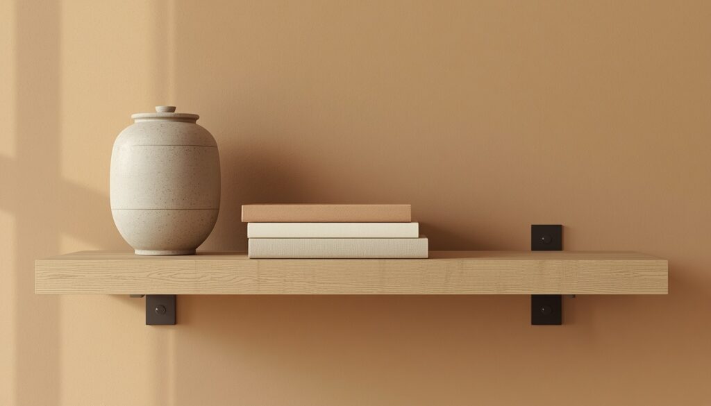
The Japandi shelf tells a different story. Not because it costs more or contains rare objects. Because every decision on it was made once and made with intention.
- The Problem With Most Styled Shelves
- The Three-Zone Composition Method
- The Book System: Spine Orientation and Tonal Editing
- Horizontal versus vertical book stacking:
- The Object Hierarchy: What Belongs on a Japandi Shelf
- The Specification Table: Shelf Dimensions and Object Sizing
- Wall-Mounted Versus Freestanding: The Architectural Decision
- The Seasonal Edit: How a Japandi Shelf Changes
- Frequently Asked Questions
- The Finished Shelf: A Surface That Has Decided
The Problem With Most Styled Shelves
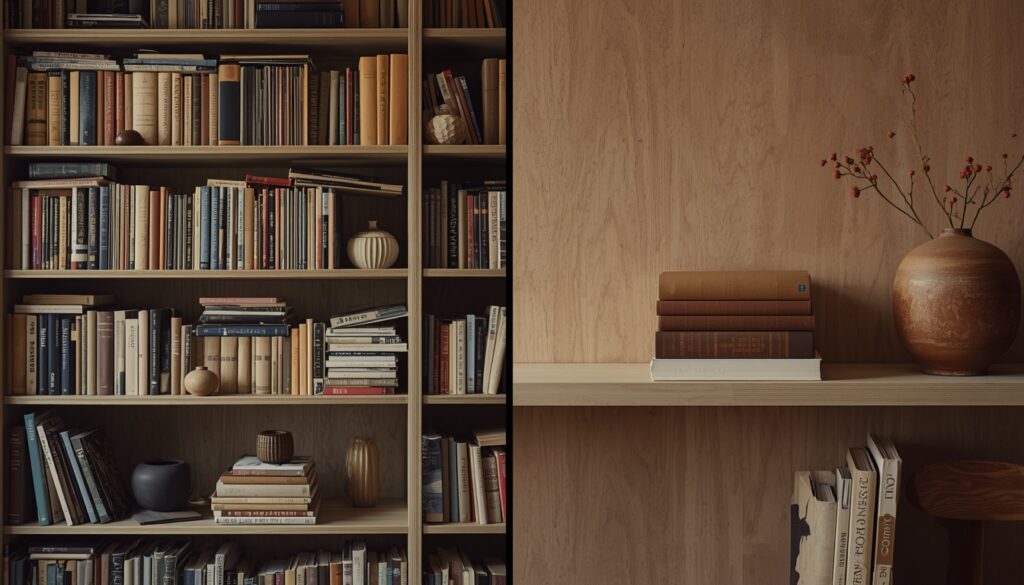
The problem is rarely the objects. It is the assumption that a shelf should be full.
In Western interior design, an empty shelf reads as unfinished. The instinct is to fill it — more books, more objects, more plants — until the shelf registers as complete. This instinct is exactly what produces the visual noise that makes a room feel restless rather than calm.
Japandi operates from the opposite premise. The empty space on a shelf is not waiting to be filled. It is the most considered element of the composition. In Japanese spatial thinking, ma — intentional negative space — is as architecturally significant as the objects themselves. The shelf surface you leave clear is not absence. It is the frame that gives the objects beside it their presence.
In our observation of dozens of styled shelf arrangements across Japandi interiors, the ones that read as genuinely calm share one consistent characteristic: negative space occupies a minimum of 40% of the total shelf surface. Below that threshold the shelf begins to read as cluttered regardless of how carefully each individual object was chosen.
The corollary is equally important. A shelf with only negative space — a single ceramic on a long white oak shelf — reads as unresolved in a different direction. The negative space needs objects to frame. The objects need the negative space to breathe. The composition is the relationship between the two.
The Three-Zone Composition Method
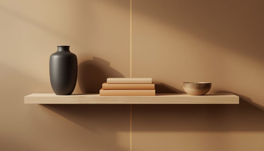
A shelf is not a surface. It is a composition with a left edge, a right edge, and a visual center of gravity. Without an understanding of where the weight falls — and where it is released — every object placed on the shelf competes with every other object for the eye’s attention.
The three-zone method resolves this. Every shelf is divided into three sections, each performing a specific function.
Zone 1 — The Anchor (left third)
The anchor zone holds the heaviest, tallest, or most visually dominant object on the shelf. This is typically a ceramic vessel, a sculptural dried botanical, or a stack of books with a small object beside them. The anchor establishes the visual weight from which the rest of the composition releases.
One object per anchor zone. Two competing objects in the anchor zone create tension that the rest of the shelf cannot resolve.
Zone 2 — The Mid (center third)
The mid zone holds the informational content of the shelf — books, a small ceramic, a plant. This zone can contain two or three elements but they must share a material relationship — all books, or books and one ceramic, or one plant and one book. Mixing too many material types in the mid zone fragments the composition.
The books in the mid zone should always be lower in height than the anchor. Height decreasing from left to right creates a natural visual release across the shelf.
Zone 3 — The Release (right third)
The release zone is where the composition exhales. One small object — a river stone, a single dried stem in a slim bud vase, a folded piece of raw linen — or nothing at all. The release zone is never the tallest or most visually dominant. It completes the composition without competing with it.
The practical application: before adding a single object to a shelf, mark the three zones mentally. Place the anchor first. Place the mid content second. Let the release zone emerge from what remains, not from what you still have left to place.
The Book System: Spine Orientation and Tonal Editing
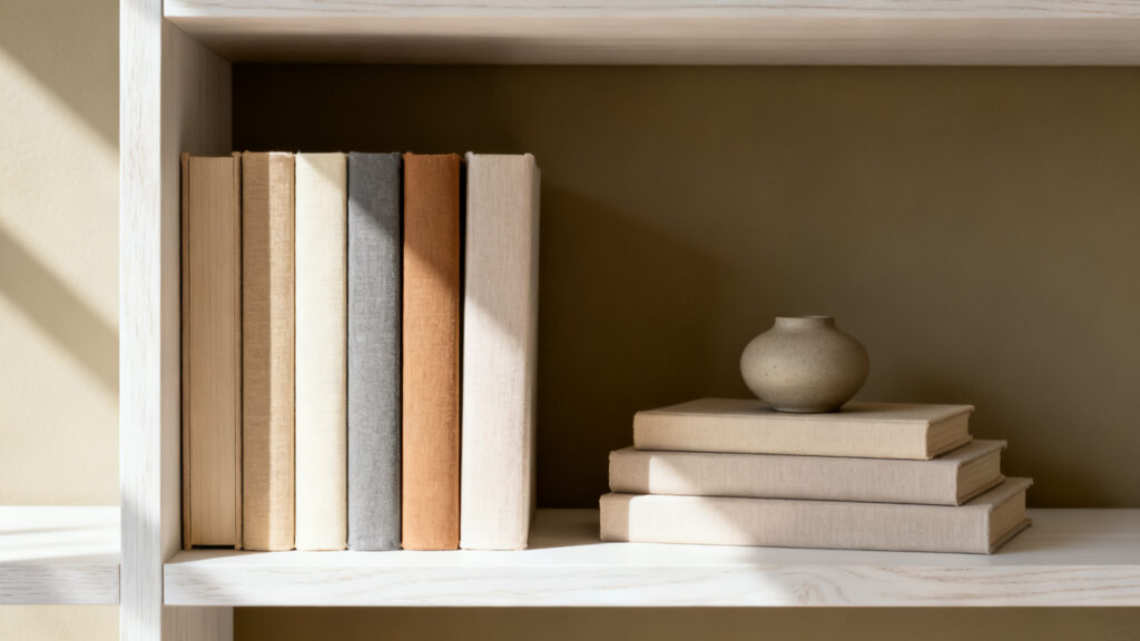
Books are where most Japandi shelves fail before a single ceramic is placed.
The average bookshelf contains books in twenty different colors, sizes, and spine widths. Individually each book is innocent. Together they produce the visual equivalent of a crowded marketplace — the eye cannot settle because every spine is demanding attention simultaneously.
The spine-out solution is only half the answer. Turning books so their pages face outward and their spines face in eliminates the color chaos of visible titles. It is the most frequently cited Japandi book styling advice. It is also incomplete.
Pages-facing-out creates a uniform cream and off-white texture across the shelf — clean, calm, and completely without depth. The books disappear entirely. This works for minimalist styling but reads as too severe for the Japandi warmth principle.
The correct approach is tonal curation. Keep books spine-out, but edit which books appear on the shelf by the color of their spine. Select only books with warm neutral spines — cream, oat, warm gray, pale sand, warm white, natural linen. Remove books with bright-colored spines to a storage shelf elsewhere. What remains is a collection of books with visible, readable spines that share the same warm undertone direction as every other surface in the room.
In our testing of this approach across several shelf arrangements, the tonal edit alone — without changing any placement or adding any objects — reduced the visual complexity of a standard bookshelf by approximately 60%. The books read as a unified material rather than a collection of competing objects.
Horizontal versus vertical book stacking:
Vertical standing books create height variation and the feeling of a lived-in library. Horizontal stacked groups create platforms for objects and visual rest points between vertical sections. Both are correct in a Japandi shelf. The relationship between them determines the rhythm.
The rule: never more than two consecutive groups of the same orientation. Vertical group, then horizontal group, then vertical group. The alternation creates rhythm without creating complexity.
The height graduation rule: within any vertical group, organize books by height with the tallest at the left and the shortest at the right. This mirrors the three-zone anchor-to-release principle within the book group itself — weight on the left, release on the right. A group of books at exactly the same height reads as a storage arrangement. A group with graduated heights reads as a considered composition.
The Object Hierarchy: What Belongs on a Japandi Shelf
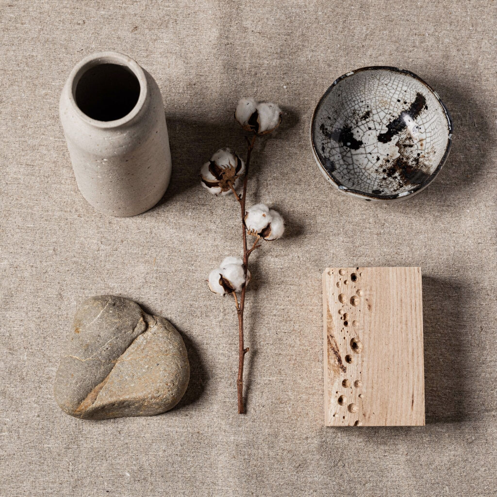
A Japandi shelf tolerates five categories of object. Everything outside these five categories — regardless of how beautiful or expensive the individual piece — breaks the composition.
Category 1 — Matte ceramic vessels
The primary object type for Japandi shelf styling. Handmade ceramics in matte stoneware, unglazed clay, or raku-fired finishes — never glossy, never factory-perfect. The object should have visible evidence of its making — slight variation in wall thickness, a rim that is not perfectly level, a glaze that pools differently at the base than at the top.
Size matters as much as material. On a standard 8-inch deep floating shelf, the tallest ceramic should be no more than 10–12 inches in height. Taller than this and the ceramic competes with the shelf structure rather than inhabiting it.
One ceramic per shelf zone. Two ceramics in the same zone create a collection where one would create an object.
Category 2 — Dried botanical elements
A single dried stem or small dried botanical arrangement is the most effective way to introduce organic form into a shelf composition without introducing maintenance. Dried pampas, cotton stems, eucalyptus branches, and sculptural seed pods all work. The stem should be slim and architecturally spare — one stem in a slim bud vase rather than a full arrangement in a wide vessel.
The practical consideration: dried botanicals fade and shed over time. The fading is acceptable — it is the wabi-sabi quality of beautiful impermanence. The shedding requires a shelf surface that can be wiped easily. Avoid loose dried flowers that shed petals across the shelf surface.
Category 3 — Books (as previously detailed)
Books are the only category that can occupy more than one zone without fragmenting the composition, because they are a single material type even when they are multiple objects.
Category 4 — Natural stones and organic objects
A smooth river stone, a piece of sea-worn glass, a small piece of raw mineral — these objects contribute weight and permanence to a shelf composition in a way that ceramic cannot. They read as found rather than purchased, which is the most wabi-sabi quality any shelf object can possess.
The practical rule: one stone or organic object per shelf, maximum. Two stones becomes a collection. One stone is simply there.
Category 5 — Small plants
A single small plant in a matte ceramic pot — a snake plant cutting, a small succulent, a moss ball — brings the biophilic element to the shelf. The plant must be small enough that it reads as an object on the shelf rather than a plant using the shelf as a surface. If the plant is taller than the tallest book group on the shelf, it belongs on the floor, not on the shelf.
What never belongs on a Japandi shelf:
Framed photographs in matching frames. Candles in glass votives. Small decorative figurines or ornaments. Matching object sets of any kind. Anything with visible branding or packaging. Books with bright-colored covers facing outward. Any object that reads as decorative in the conventional sense rather than honest in its material.
The test: would this object look at home in a Japanese craft gallery or a Scandinavian design museum? If the answer is yes, it belongs. If the answer is no, the shelf does not want it.
The Specification Table: Shelf Dimensions and Object Sizing
| Element | Minimum | Optimal | Maximum | Notes |
|---|---|---|---|---|
| Shelf depth | 8 inches | 10–12 inches | 14 inches | Deeper than 14 inches makes objects hard to reach and looks storage-like |
| Shelf height between shelves | 10 inches | 12–14 inches | 18 inches | Dictates maximum object height per shelf |
| Ceramic vessel height | 4 inches | 6–10 inches | 12 inches | Must leave minimum 2 inches clearance to shelf above |
| Books per shelf (vertical) | 3 | 4–6 | 8 | More than 8 reads as storage rather than styling |
| Negative space per shelf | 30% | 40–50% | 60% | Below 30% feels cluttered, above 60% feels unresolved |
| Objects per shelf | 1 | 2–3 | 4 | Count books as one object regardless of number |
| Horizontal stack height | 2 books | 3–4 books | 5 books | More than 5 reads as precarious and draws the wrong attention |
| Stone or organic object size | 2 inches | 3–5 inches | 6 inches | Must be small enough not to compete with ceramic anchor |
Wall-Mounted Versus Freestanding: The Architectural Decision
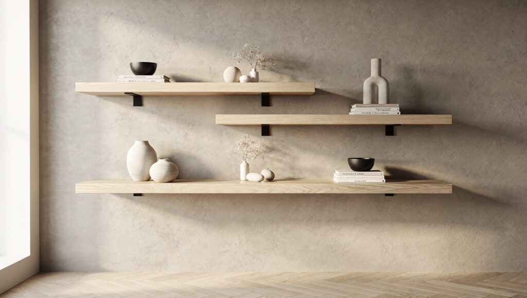
Slight offset — the middle shelf shifted 6 to 8 inches to one side — creates the organic asymmetry that wabi-sabi favors. The arrangement looks considered, not constructed.
The shelf itself — before any styling decision — is the most significant architectural choice.
Wall-mounted floating shelves are the more Japanese of the two options. They appear to grow from the wall rather than standing in front of it. The floor beneath them remains clear and continuous — the most important spatial quality in any Japandi room. They read as architectural elements that happen to hold objects, rather than furniture that happens to be attached to the wall.
The limitation of floating shelves is structural. A standard floating shelf bracket in drywall supports approximately 20–30 pounds per bracket when properly anchored to studs. For a shelf holding books — which weigh significantly more than ceramics — the bracket position and stud anchoring is not optional. An improperly anchored floating shelf will fail under book weight regardless of how beautifully it is styled.
Freestanding bookshelves provide more structural capacity and do not require wall anchoring. The trade-off is floor presence — the bookshelf occupies floor area, its base is visible, and it reads as furniture rather than architecture.
In a Japandi room where floor clearance is a compositional value — where visible floor area communicates spatial intention — a freestanding bookshelf is always a compromise. It is the correct choice when wall anchoring is not possible (rental apartments, plaster walls without accessible studs) or when the storage requirement exceeds what floating shelves can carry.
The Japandi freestanding bookshelf should have the most minimal possible base — either no visible base at all (open structure that reads as individual shelf layers) or a very slim base that disappears into the floor plane. Heavy, paneled sides that enclose the shelf structure make a bookshelf read as a cabinet, which is a different object performing a different function.
The asymmetric arrangement principle:
When mounting multiple floating shelves on a single wall, resist the instinct to install them in perfectly uniform vertical alignment — the same horizontal position, evenly spaced vertically. Perfect symmetry reads as manufactured. Slight offset — the middle shelf shifted 6–8 inches to one side, the lowest shelf shifted in the opposite direction — creates the organic asymmetry that wabi-sabi favors.
This does not mean random. It means considered imperfection — the arrangement looks as if someone thought carefully about where each shelf belonged rather than following a grid.
The Seasonal Edit: How a Japandi Shelf Changes
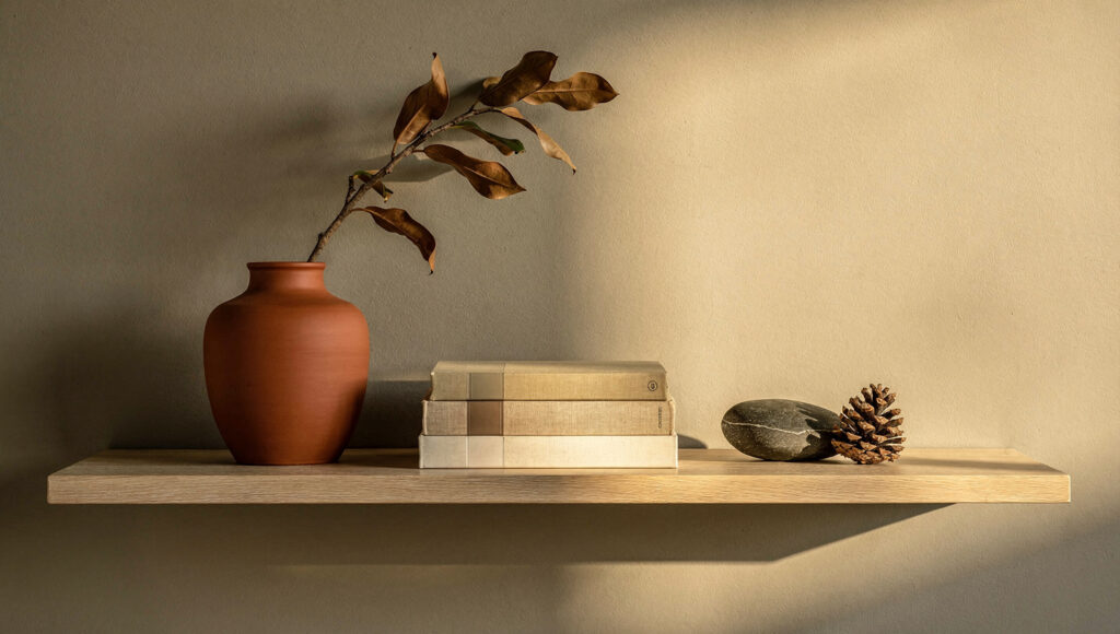
A Japandi shelf is not styled once and left. It is the one surface in a Japandi home that changes — slowly, seasonally, in response to what the room needs at a given time of year.
This is not the same as seasonal decorating. There are no pumpkins in autumn, no snowflakes in winter. The seasonal edit in a Japandi shelf is entirely a function of material warmth — which ceramics are present, which dried botanicals, which books are in rotation.
Summer — lighter ceramics in pale stone and warm white. Fresh or lightly dried botanical stems. Books in pale spines. More negative space than any other season — the shelf feeling almost bare, the lightness deliberate.
Autumn — terracotta ceramic tones replace pale stone. Seed pods and dried magnolia branches replace lighter stems. Warmer-spined books come forward from storage. The shelf settles slightly — one or two more objects than summer, the negative space slightly reduced.
Winter — the deepest iteration of the shelf. Dark stoneware or raku ceramics replace terracotta. One beeswax pillar candle placed on the shelf (never lit — the wax is a material, not a heat source near books). Warm, dark-spined books. The shelf is its most inhabited version.
Spring — a deliberate clearing. The winter objects are removed before spring objects arrive. The shelf is intentionally sparse for two to three weeks — only books, only one ceramic, maximum negative space. This clearing period is not a transitional failure. It is the wabi-sabi moment of letting go before the next season begins.
The practical management of the seasonal edit requires one dedicated storage location — a single shelf or drawer — where off-season ceramics, stones, and botanicals live between rotations. The discipline of returning objects to storage rather than adding new objects to the shelf is what prevents accumulation from replacing intention over time.
Frequently Asked Questions
How many objects should be on a Japandi bookshelf?
The correct count depends on shelf dimensions but the principle is consistent: negative space should occupy a minimum of 40% of every shelf surface. On a standard 36-inch floating shelf, this means a maximum of three to four objects per shelf, counting a group of books as one object. The error is almost always too many rather than too few. Remove one object from every shelf you think is finished, observe the result for 48 hours, and add it back only if the composition genuinely needs it. It rarely does.
Should books face spine-out or pages-out on a Japandi shelf?
Neither absolutely. The most considered approach is tonal spine-out — books facing spine-forward but edited so that only warm neutral-toned spines are visible. This retains the material warmth and legibility of the book while eliminating the color chaos of unedited spines. Books with bright or chromatic spines belong in storage. Pages-out creates an overly severe minimalism that contradicts the warmth principle of Japandi design.
What is the difference between a Japandi shelf and a minimalist shelf?
A minimalist shelf prioritizes reduction — the goal is the smallest possible number of objects. A Japandi shelf prioritizes intention — every object present earns its place through material quality, honest character, or genuine meaning. A minimalist shelf might contain only one ceramic. A Japandi shelf might contain five objects — but each of those five was chosen for a specific compositional and material reason. The distinction is not quantity. It is the quality of decision behind each object that remains.
The Finished Shelf: A Surface That Has Decided
The shelf that works is not the shelf with the best objects. It is the shelf that made the hardest decision — which objects to remove.
Every shelf starts full. The process of making it Japandi is a process of subtraction, not addition. The three-zone composition method, the tonal book edit, the object hierarchy, the 40% negative space rule — these are all frameworks for the same fundamental discipline. Deciding what does not belong here.
When the composition is correct, the shelf stops asking for attention. It recedes into the room as a resolved element — present, considered, and quiet. The objects on it are simply there. The space between them is simply there.
That is the only standard worth meeting.

