
This post contains affiliate links. If you purchase through these links, Homeoration earns a small commission at no extra cost to you — it helps keep this content free.
Designing a small living room often feels like compromise. You want comfort, warmth, and personality — but every extra piece seems to make the room feel tighter.
That’s why Japandi works so well in compact spaces.
Instead of adding more, Japandi asks you to subtract. Instead of decorating, it encourages balance. In small rooms, that shift in mindset changes everything.
Small Japandi living room ideas work by controlling visual weight, light flow, and proportion. Shrinking the furniture is not the point. When those three elements are handled carefully, even a compact apartment can feel calm and intentional.
If you’re new to the style, begin with our complete guide to Japandi Living Room Ideas, then return here for small-space execution strategies.
- Which One Fits You? Quick Answer
- What Makes a Small Japandi Living Room Work
- Choose a Low-Profile Sofa to Increase Vertical Space
- Limit the Color Palette to Three Tones Maximum
- Float the Sofa Slightly Forward
- Keep the Coffee Table Slim or Replace It
- Use Closed Storage to Remove Visual Noise
- Anchor with a Neutral Rug
- Why Small Spaces Feel Overwhelming — and How Japandi Fixes It
- Prioritize Natural Light Over Decorative Lighting
- Avoid Oversized Sectionals
- Use Vertical Negative Space Strategically
- Introduce One Texture Hero Piece
- Keep Walkways Clear (Minimum 24 Inches)
- Edit Ruthlessly
- Common Mistakes in Small Japandi Living Rooms
- Why Japandi Works Better Than Other Styles in Small Spaces
- Frequently Asked Questions
Which One Fits You? Quick Answer
If you want to skip the explanation, here is the decision in one table.
| Element | Small-room spec |
|---|---|
| Sofa width | 70–78 in |
| Sofa back height | 28–32 in |
| Sofa float from wall | 3–5 in |
| Coffee table height | 14–16 in |
| Coffee table width | ≤ two-thirds of sofa length |
| Sofa to coffee table | 18 in |
| Primary walkway | 30–36 in |
| Secondary walkway | 24 in minimum |
| Rug size | 5×8 ft minimum, front legs on |
| Bare floor around rug | 8–12 in |
| Wall left visually empty | 40% minimum |
| Palette | 3 tones (roughly 60/30/10) |
| Artificial light | 2700–3000K, 2–3 low sources |
What Makes a Small Japandi Living Room Work
Small-space Japandi is not about shrinking furniture. It works by controlling three things: visual weight, so low, light-legged pieces keep walls and floor visible; light flow, so daylight reaches the corners; and proportion, so every piece is scaled to the room rather than to a showroom. Get those right and a compact room reads calm.
Choose a Low-Profile Sofa to Increase Vertical Space
Takeaway: A sofa back under 32 inches leaves more visible wall above it, and your eye reads that ratio as a taller ceiling. Visible legs let the floor and light continue underneath.
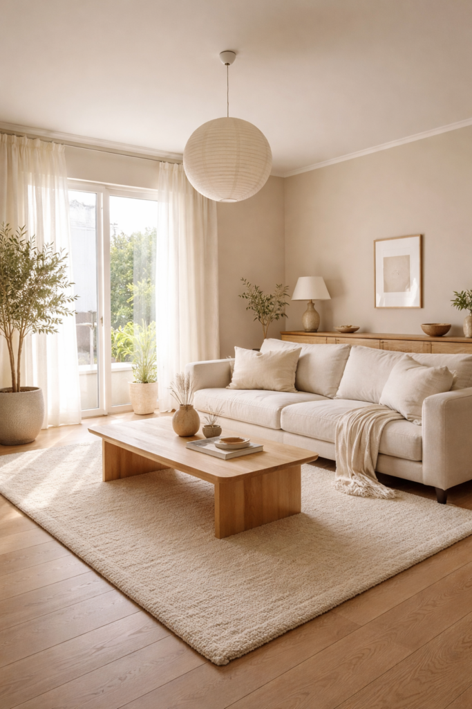
Tall furniture visually lowers ceilings. In small Japandi living rooms, a low sofa at 28 to 32 inches high leaves the wall above it open, and that open wall is what creates perceived height.
The mechanism is relative measurement. Your eye does not read ceiling height in absolute terms, it reads the ratio between the furniture and the wall above it. A 34-inch sofa back against an 8-foot ceiling leaves roughly five feet of visible wall. Drop that back to 29 inches and you gain five inches of visible wall, which the eye registers as a taller room even though nothing structural changed.
Visible legs do a second job. A raised frame lets the floor plane continue underneath, so the eye reads the full floor area rather than stopping at a solid base. Light travels under it too, which prevents the heavy shadow mass that makes a room feel smaller.
Look for slim arms, a visible wooden base, and tight back cushions, which hold their shape so the silhouette stays crisp instead of slumping over time. Avoid deep overstuffed sectionals and tall reclining backs.
In a 450 square foot studio, a slim 72-inch sofa with visible legs can make the entire wall feel longer, because the open space beneath the frame lets light travel where a bulky sectional would block it completely.
If you are shopping rather than working with what you own, the specification matters more than the brand. You want a total back height under 32 inches, a seat depth of at least 25 inches so the low profile does not cost you comfort, solid wood legs in oak, walnut, or ash rather than plastic or chrome, and a natural fiber cover in linen, wool blend, or bouclé. A compact low-profile sofa in this specification will do more for a small room than any amount of styling, because the height and the base are decided at purchase and cannot be fixed afterward.
Limit the Color Palette to Three Tones Maximum
Takeaway: Every extra tone creates a visual boundary, and boundaries chop a small room into sections. Three tones means two boundaries in the entire space.
Too many tones create fragmentation. The ideal small-room palette is warm off-white walls, light oak wood, and one muted accent in taupe, clay, or soft charcoal.
The reason three works is that every additional tone creates a visual boundary, and your eye reads boundaries as edges. Edges divide a space into sections, and a small room divided into sections feels like several cramped areas rather than one calm volume. Hold the palette to three and there are only two boundaries in the whole room, so the eye travels across it uninterrupted and the space reads as a single continuous area.
The practical split is roughly 60 percent for the dominant neutral on walls and large upholstery, 30 percent for the wood tone across flooring and furniture, and 10 percent for the accent. That last 10 percent should appear two or three times around the room rather than once, so it reads as intentional rather than accidental.
Keep the accent low in saturation. A muted clay works in a small room where a bright terracotta would advance toward you and shrink the space.
For tone layering, see the Japandi color palette guide, and the Japandi accent colors guide covers where that single accent belongs.
Float the Sofa Slightly Forward
Takeaway: Three to five inches of gap creates a shadow line behind the sofa. The eye reads that shadow as depth, and the wall visually recedes. You lose no usable floor.
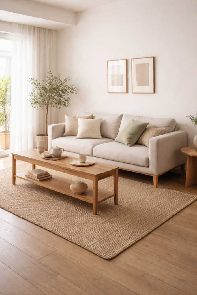
Counterintuitive but effective. Pulling the sofa 3 to 5 inches from the wall prevents the boxed-in effect common in small rooms.
Most people push furniture flat against the wall to reclaim floor space, which is exactly why the trick works: when a sofa touches the wall, the eye reads the two as a single flat plane, and that plane advances toward you. Introduce a small gap and a shadow line appears behind the sofa. The eye reads that shadow as depth, and the wall visually recedes.
You lose almost nothing. Three inches of floor is not usable space, and the furniture footprint barely moves. What you gain is a room that reads as having layers rather than one flat perimeter.
The gap has a practical benefit too. Air circulates behind the upholstery, which stops the musty edge that develops when a sofa back is pressed against an exterior wall, and it makes cleaning behind the piece possible.
This principle is explained further in the Japandi living room layout ideas guide.
Keep the Coffee Table Slim or Replace It
Takeaway: Match the table top to the sofa seat height so the two read as one low horizontal band. Keep it to two-thirds the sofa length, with 18 inches of clearance.
In rooms under 200 square feet, oversized coffee tables block circulation. Ideal dimensions are 14 to 16 inches high and no more than two-thirds the length of the sofa.
Height is the specification people get wrong. The table top should sit within an inch or two of the sofa’s seat height, because when the two align the eye reads them as one low horizontal band rather than two competing objects. A table taller than the seat cushion breaks that line and makes the seating area feel cluttered even when nothing is on the table.
The two-thirds rule handles proportion. A table that matches the sofa in length creates a solid visual block in the middle of the room, while one that stops short leaves breathing room at both ends and lets the rug and floor show through.
Leave 18 inches between the sofa edge and the table. Less than that and people turn sideways to get past, which is the physical version of a room feeling tight.
Alternatively, use two nesting tables that separate when you need surface and tuck away when you need floor, or replace the table entirely with a single wooden stool.
Use Closed Storage to Remove Visual Noise
Takeaway: Twenty objects on open shelves are twenty things to process. The same objects behind a door are one calm plane. Same capacity, a fraction of the visual load.
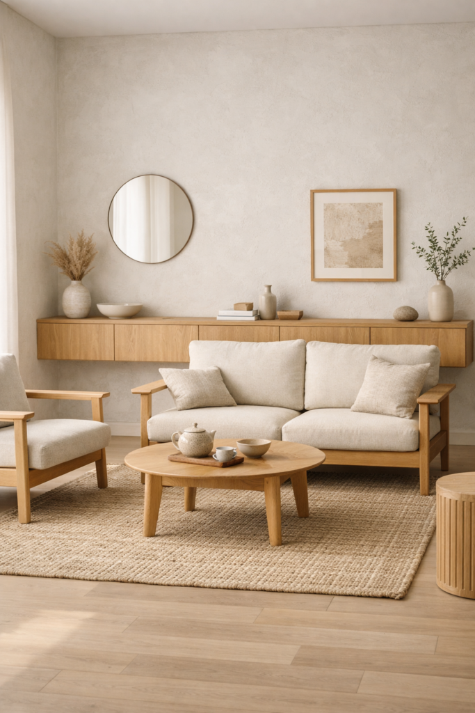
Open shelving overwhelms compact rooms. Better options are floating wood consoles, wall-colored cabinetry, and storage benches.
Open shelves fail in small rooms for a specific reason: every object on them is a separate item your eye has to process. Twenty books, six ceramics, and a plant equal twenty-seven things demanding attention. A closed cabinet holding the same objects presents one calm plane. The storage capacity is identical; the visual load is not.
Painting cabinetry the same color as the wall takes this further. Without a tonal boundary between the furniture and the wall behind it, the storage stops reading as a separate object and recedes into the architecture, which means it occupies almost no visual space at all.
A floating console applies the same principle as the low sofa. Lifting it off the floor keeps the floor plane continuous underneath, so the room reads at its full size rather than stopping at a solid base.
If you want one open surface, allow yourself a single shelf and follow the rule of three: one vessel, one book, one organic object, with clear space either side.
For furniture selection, see the Japandi living room furniture guide.
Anchor with a Neutral Rug
Takeaway: Front legs on the rug. A rug that touches nothing becomes an island, and the eye reads the island as the size of the room.
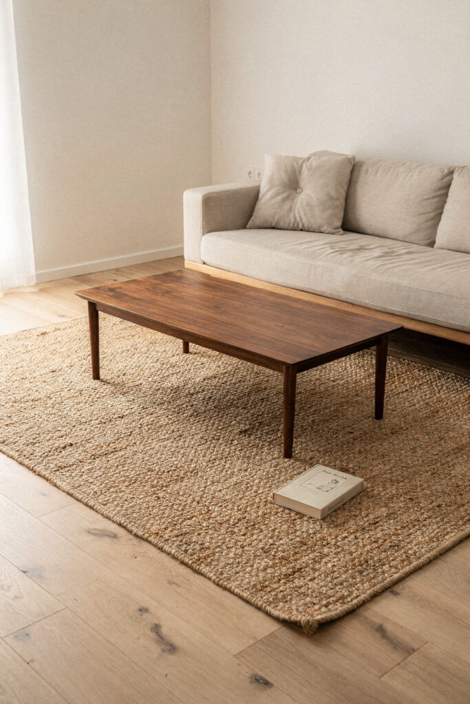
Even small rooms benefit from zoning. The rug should extend under the front sofa legs, stay within the neutral palette, and avoid heavy pattern. Texture matters more than design.
The front-legs rule is the one that decides whether a rug enlarges or shrinks the room. A rug floating in the middle with no furniture on it creates a small island, and the eye reads the island as the size of the usable area, which makes the whole room feel smaller than it is. Run the rug under the front legs and the furniture and floor covering become one connected zone, so the eye reads the larger combined shape.
Size accordingly. In most small living rooms that means at least 5 by 8 feet, and leaving 8 to 12 inches of bare floor visible around the edges, which frames the zone without crowding the walls.
Pattern is the thing to skip. In a low-contrast room, a patterned rug becomes the loudest element and pulls the eye down, flattening the space. A flat-weave wool or jute in a warm neutral gives you the texture without the noise.
When buying, the material and construction matter more than the design. Look for a flat-weave wool or jute rug in a warm neutral, sized at least 5 by 8 feet, with a low pile and no border pattern. Flat weave keeps the floor plane visually thin, which matters in a small room where a thick shag adds visual bulk underfoot, and wool or jute gives you the texture that lets the rug act as your one hero surface without introducing color.
Why Small Spaces Feel Overwhelming — and How Japandi Fixes It
Small rooms often feel stressful because the eye has nowhere to rest. Too many objects, too many contrasts, too many vertical interruptions.
Japandi solves this by limiting variation. When tones are cohesive and furniture stays low, the brain processes the space faster. That psychological ease is what we perceive as calm.
In compact interiors, simplicity is not aesthetic — it’s functional.
Prioritize Natural Light Over Decorative Lighting
Takeaway: Shadowed corners read as boundaries. Light reaching the corners removes the edges, which is why heavy drapery costs a small room more than a large one.
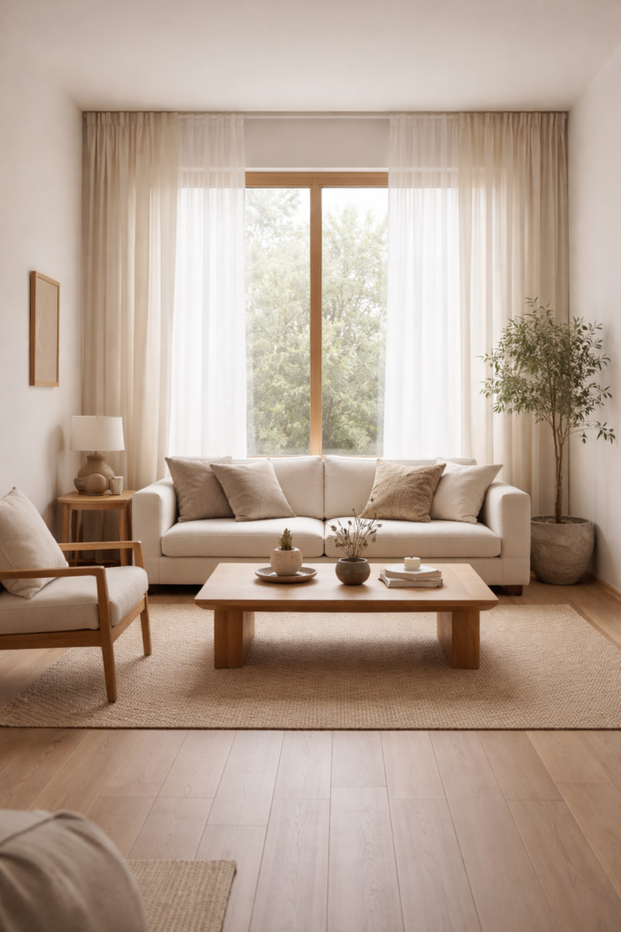
In small Japandi living rooms, natural light is the focal point. Arrange seating toward the window, use sheer curtains instead of heavy drapes, and keep artificial lighting soft at 2700K to 3000K.
Daylight makes a small room feel larger because it reaches the corners. Corners left in shadow read as boundaries, and a room whose boundaries are visible feels finite. Light landing in the corners removes those edges and the space reads as open. This is why heavy drapery costs you more in a small room than in a large one: you lose the light that was doing the expanding.
Sheer linen is the compromise that works. It transmits most of the available daylight while still providing privacy, and it softens the hard rectangle of the window frame.
For evening, avoid lighting the room from a single overhead fixture. One central source casts everything outward from one point and flattens the space. Two or three low sources at 2700K, positioned at different heights and distances, create overlapping pools of light, and that overlap is what gives a small room depth after dark.
Avoid Oversized Sectionals
Takeaway: A sectional commits two walls and fixes your only walking route. Two separate pieces seat the same people and leave a gap the eye can travel through.
L-shaped sofas dominate small footprints. Better options are a two-seater plus a chair, modular slim seating, or floor cushions. Scale determines calm.
A sectional’s real cost is not floor area, it is that it commits two walls at once and blocks circulation on both axes. Once an L is in place, the walking route through the room is fixed, and in a small space there is usually only one workable route to begin with.
A two-seater plus a single chair seats the same number of people, but the chair can be moved, angled, or removed entirely when you need the floor. That flexibility is worth more in a small room than the extra cushion length.
Separate pieces also create multiple sightlines. With a sectional, you see one continuous mass. With two pieces and a gap between them, the eye travels through the gap to the floor and wall behind, and that visible depth reads as more space.
If you genuinely need the seating capacity, modular slim seating gives you the option to reconfigure rather than commit..
Use Vertical Negative Space Strategically
Takeaway: Keep 40 percent of the wall empty, especially the band above the furniture. Fill it with a gallery wall and you undo everything the low sofa was doing.
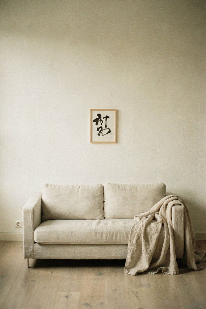
Leave at least 40 percent of wall area visually empty. Do not fill it with gallery walls or over-layered floating shelves. Negative space is functional, not decorative.
This is ma, the considered interval, doing practical work. In Japanese design the space around an object is what allows the object to register. In a small room it does something additional: empty wall gives the eye somewhere to rest, and a room where the eye can rest feels calm regardless of its dimensions.
The 40 percent applies to the upper half of the wall in particular. Because your furniture is low, the band above it is the largest continuous surface in the room, and keeping it clear is what converts low furniture into perceived height. Fill that band with a gallery wall and you have undone the work the low sofa was doing.
One large piece, correctly scaled, beats many small ones here, since ten frames create ten focal points where one creates a single calm anchor. The full approach is in the Japandi living room wall decor guide.
Introduce One Texture Hero Piece
Takeaway: Texture adds interest without adding objects or tones, which is why it is the cheapest richness in a small room. One hero only, or it behaves like pattern.
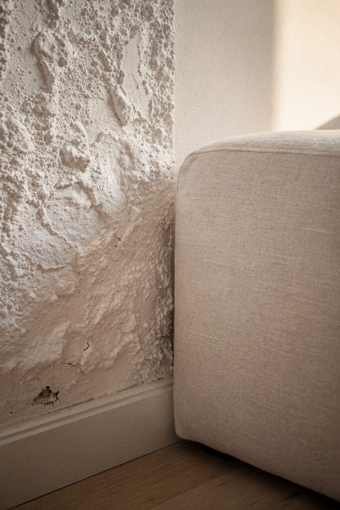
Small rooms need one tactile focal point: a woven rug, a textured plaster wall, or a handcrafted wood table. Everything else should be restrained.
The reason a single texture hero works is that it lets you create interest through surface rather than through color or object count, both of which cost you space. A limewash wall or a heavily textured rug gives the room something to look at without adding a single item to the floor, and without introducing another tone to fragment the palette.
Restricting yourself to one is what keeps it working. Two or three competing textures in a compact room start behaving like pattern, and the eye moves between them without settling, which is the opposite of the effect you want.
Choose the hero based on the surface you have most of. If your walls are the dominant surface, put the texture there. If the floor is, use the rug. Then keep everything else smooth and quiet, so the one textured element reads as deliberate.
Keep Walkways Clear (Minimum 24 Inches)
Takeaway: Below 24 inches an adult turns sideways to pass, and the body registers that every single time. That is why a room can feel tight without looking cluttered.
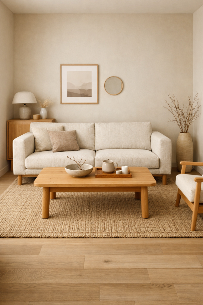
Circulation space affects psychological calm. Maintain 24 to 30 inches of walking clearance and clear paths from entry to seating. If movement feels tight, reduce furniture.
The numbers split by route. A primary path, meaning the one you use to enter the room or cross it daily, wants 30 to 36 inches. A secondary path, such as squeezing between a chair and a wall to reach a window, works at 24. Below 24 inches an average adult turns their body to pass, and that small physical adjustment is registered every time, which is why a room can feel stressful without looking cluttered.
Between the sofa and the coffee table, 18 inches is the working minimum, since you are stepping through rather than walking along.
The honest instruction is the last one. If the clearances do not work, the answer is not rearranging, it is removing a piece. Most small rooms that feel tight contain exactly one item too many, and the room improves the moment it leaves..
Edit Ruthlessly
Takeaway: Ask in order: does it function, does it add warmth, does it disrupt balance. Most tight small rooms contain exactly one item too many.
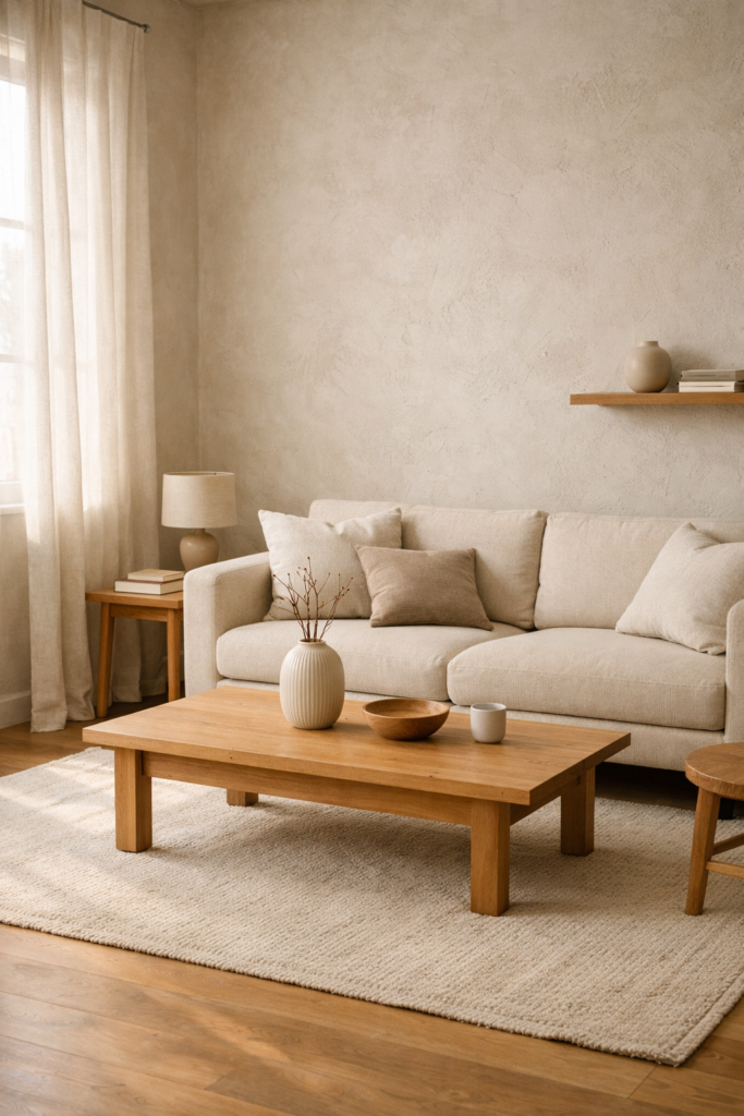
Japandi in small rooms requires discipline. Ask whether the piece serves a function, whether it adds warmth, and whether it disrupts balance. If not, remove it.
The three questions work because they are ordered. Function first, since anything that fails there is decoration and a small room cannot afford decoration. Warmth second, because a room that passes only the function test ends up sparse and cold, which is the failure mode of minimalism rather than Japandi. Balance last, as the tiebreaker between two pieces that both pass the first two.
The practical version is one in, one out. Every new object entering a small room displaces an existing one, which forces the comparison at the moment of purchase rather than months later when the room has quietly filled again.
Editing is also not a single event. Small rooms accumulate faster than large ones because there is less slack to absorb it, so the room needs the same pass every few months to stay as it was designed.
Common Mistakes in Small Japandi Living Rooms
- Choosing oversized sofas because they “look comfortable”
- Mixing three or more wood undertones in one small space
- Hanging heavy curtains that block natural light
- Using bold artwork that dominates the wall
- Over-layering decorative cushions
- Ignoring walkway clearance
In small interiors, every object has amplified impact. Editing is not about minimalism — it’s about clarity.
Why Japandi Works Better Than Other Styles in Small Spaces
Unlike maximalist interiors, Japandi:
- Avoids clutter
- Uses cohesive palette
- Reduces visual noise
- Encourages material harmony
Compact rooms benefit from clarity.
Japandi design principles are frequently explored in contemporary architecture features on Dezeen.
Frequently Asked Questions
Is Japandi suitable for very small apartments?
Yes, and it is arguably better suited to small apartments than to large ones. The style’s core moves all happen to be small-space moves: a restrained palette that avoids fragmenting the room into sections, low furniture that leaves wall visible above it, and a strict edit that keeps object count down. Where other styles add to fill a space, Japandi subtracts, and subtraction is exactly what a compact room needs. The one honest caveat is that Japandi is less forgiving than it looks. Its calm depends on visible empty space, so a small Japandi room that accumulates clutter loses the effect faster than a more layered style would. It rewards discipline rather than budget.
Can I use dark tones in a small Japandi living room?
Yes, but restrict them to accents and balance them against light walls. Dark surfaces absorb rather than reflect light, so a dark wall in a small room removes the daylight that was making the space feel open, and the walls visually close in. The safer approach is to put the dark note on small objects: black hardware, a charcoal cushion, a blackened metal lamp, or the legs of a chair. That gives the eye somewhere to land, which a fully neutral small room needs in order to avoid looking flat, without costing you light. If your room is bright and south-facing you have more freedom, and a single dark piece of furniture can add real depth.
What is the best sofa size for a small Japandi room?
Typically 70 to 78 inches wide for most compact layouts, with a back height of 28 to 32 inches and visible legs. Width matters less than height and base. A sofa taller than 32 inches eats into the wall above it, which is the surface doing the work of making the ceiling feel higher, and a solid plinth base blocks the floor line and the light that would otherwise travel underneath. Leave 18 inches between the sofa edge and the coffee table so people walk through rather than step over, and keep the sofa to roughly two-thirds of the wall it sits against so the wall still reads as longer than the furniture.
A small living room does not need to feel temporary or restricted. With thoughtful scaling, restrained color, and intentional furniture choices, compact spaces can feel more peaceful than large ones.
Japandi design rewards discipline — and in smaller homes, that discipline creates real transformation.
When in doubt, remove one piece. Calm often lives in the space you leave empty.

