
Most layout advice tells you what a room should feel like. Calm. Balanced. Uncluttered. None of that helps when you are standing in the doorway with a sofa that does not fit where you wanted it and a walkway that forces everyone to turn sideways.
Layout is the one part of interior design that is genuinely measurable. Whether a room feels calm has less to do with taste than with clearances, sightlines, and where the furniture meets the floor. Get the numbers right and the room reads as composed. Get them wrong and no amount of styling fixes it.
This guide gives you twelve Japandi living room layouts with the actual measurements each one needs: clearances, distances, minimum room sizes, and the reasoning behind them. Start with the decision table to find the layouts built for your room shape, then read those sections.
The Short Answer
A Japandi living room layout works by protecting three things: circulation, so walkways stay at least 24 to 36 inches; sightlines, so low furniture under 32 inches keeps the room visually open; and a single clear focal point, whether that is a window, a fireplace, or the seating group itself. Everything else follows from those three.
- Which Layout Fits Your Room?
- Why Layout Matters More in Japandi Than in Other Styles
- 1. Centered Low Sofa Layout
- 2. Floating Furniture Layout
- 3. Symmetrical Balance Layout
- 4. Asymmetrical Organic Layout
- 5. Corner Conversation Layout
- 6. Open-Plan Divider Layout
- 7. Window-Focused Layout
- 8. No-Coffee-Table Layout
- 9. L-Shaped Sectional Layout
- 10. Fireplace-Centered Layout
- 11. TV Wall Minimal Layout
- 12. Small Apartment Minimal Flow Layout
- Common Layout Mistakes
- Frequently Asked Questions
- The Honest Answer
Which Layout Fits Your Room?
Match your room’s actual shape to the layouts built for it, then read those sections below.
| Room shape | Best-fit layouts | Avoid |
|---|---|---|
| Square, medium (12×12 to 15×15 ft) | Centered Low Sofa, Symmetrical Balance | Corner Conversation, which wastes the room’s natural balance |
| Narrow or rectangular | Floating Furniture, No-Coffee-Table, TV Wall Minimal | Symmetrical Balance, which rarely fits two full seating walls |
| Open-plan (living plus dining or kitchen) | Open-Plan Divider, Floating Furniture | Fireplace-Centered, unless the fireplace sits in the living zone |
| Small apartment (under 250 sq ft) | Small Apartment Minimal Flow, Corner Conversation, No-Coffee-Table | L-Shaped Sectional and Symmetrical Balance, which both need width you do not have |
| Has a fireplace | Fireplace-Centered | Window-Focused, which creates competing focal points |
| Has a strong window view | Window-Focused | Fireplace-Centered, unless the two share a wall |
Why Layout Matters More in Japandi Than in Other Styles
Takeaway: Strip a room to a few pieces and the arrangement becomes the design. There is nothing else for the eye to look at.
In a maximalist room, layout errors hide. There is enough visual information that a slightly awkward walkway or an off-balance seating group disappears into the pattern and the object count.
Japandi removes that cover. When you strip a room back to a few pieces and a lot of empty floor, the arrangement becomes the design. There is nothing else for the eye to look at, so proportion, spacing, and negative space carry the entire room. A Japandi room with the wrong layout does not look understated. It looks unfinished.
This is also why the numbers matter here more than they do elsewhere. In a layered room you can absorb a 20-inch walkway because there is a lot going on. In a Japandi room, the same 20 inches reads as the single most noticeable thing in the space, because it is one of very few things happening.
The upside is that layout is the cheapest lever you have. Every arrangement below can be tested in an afternoon with the furniture you already own.
1. Centered Low Sofa Layout
Takeaway: One unambiguous anchor on the longest wall. 18 inches clearance on open sides, back under 32 inches, 12x12 ft minimum.
Anchor the room with a single low sofa positioned centrally against the longest wall or floating just in front of it, then keep everything else subordinate to it.
This works because a low sofa placed on the dominant wall gives the room one unambiguous anchor. Your eye finds it immediately and stops looking, which is the physical basis of a calm room. Everything else in the space then reads as secondary rather than competing.
Leave at least 18 inches of clearance on every side the sofa is not against a wall, and center it on the room’s longest sightline rather than on the door. Those two are often different, and the sightline matters more, because that is the view people actually hold when sitting.
A back height under 32 inches keeps the effect reading as intentional. A tall sofa placed away from the wall looks like it has not found its spot yet, since the height creates a visual barrier that the low profile avoids.
This layout works best at 12×12 feet or larger. Below that, the clearance it needs starts eating into walkway space elsewhere in the room.
For the sofa itself, the Japandi sofa buying guide covers the four specifications that decide whether a low-profile sofa works.
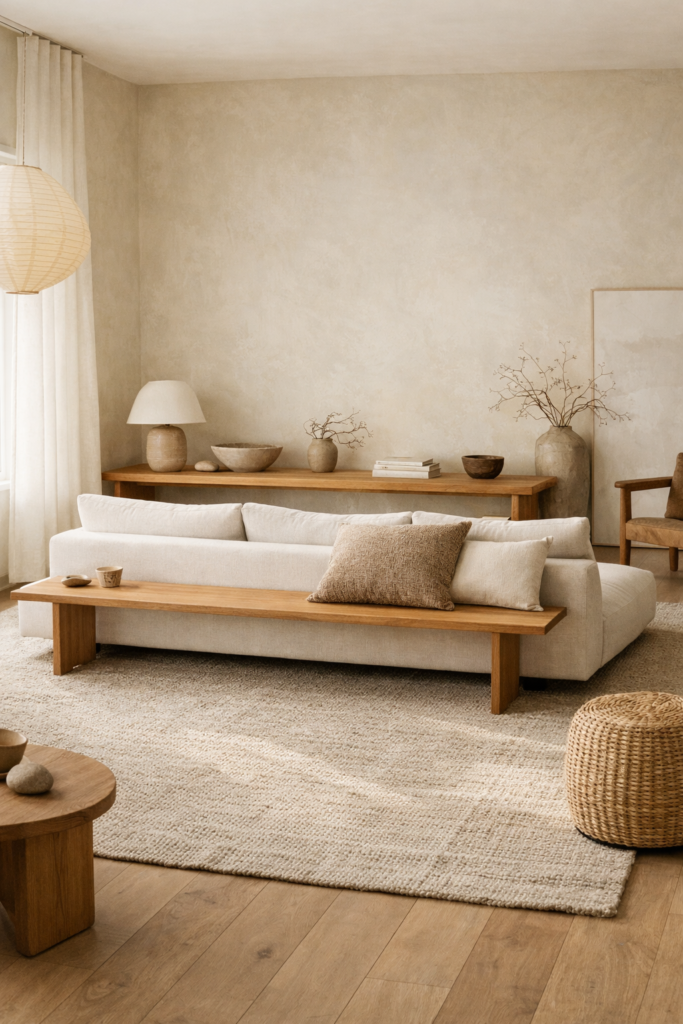
2. Floating Furniture Layout
Takeaway: The gap creates a shadow line, the eye reads shadow as depth, the wall recedes. Float 6 to 10 inches, console 12 to 16 deep, 13 ft room minimum.
Pull the sofa away from the wall entirely and let it define the seating zone, with a console filling the space behind it.
The reason this enlarges a room rather than shrinking it is depth perception. When a sofa touches the wall, the eye reads the two as a single flat plane, and that plane advances toward you. Introduce a gap and a shadow line appears behind the sofa. The eye reads that shadow as depth, and the wall visually recedes.
Float the sofa 6 to 10 inches from the wall, which is more than the 3 to 5 inches used for a wall-backed sofa, because here the gap has to fit a console. A console 12 to 16 inches deep leaves enough clearance for a person to pass on the far side without brushing the sofa back.
This layout needs a minimum room depth of 13 feet to fit sofa, gap, console, and a walking path behind the console. Below that, the console becomes a squeeze point rather than a feature, and you are better off with the centered layout above.
When you shop for the console, the construction claim matters more than the look. Wood grain and walnut finish usually mean a printed or veneered surface over MDF, which cannot be oiled and chips at the edges rather than wearing. Look for solid oak or solid walnut in the listing, a depth of 12 to 16 inches, and a length between two-thirds and three-quarters of the sofa width so the two read as a pair. A slim solid-wood console table is worth getting right, since a console too deep turns the path behind the sofa into an obstacle.
3. Symmetrical Balance Layout
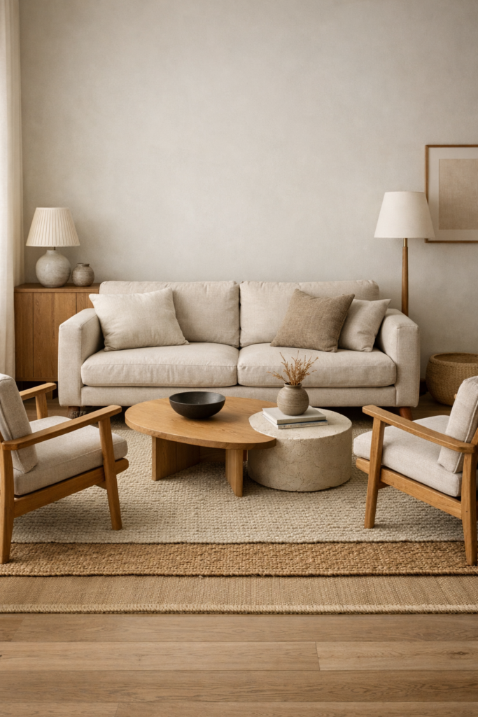
Takeaway: Chairs 42 to 48 inches apart, sofa-to-chair under 8 feet, 13 feet of wall-to-wall width minimum.
Place two matching chairs facing a sofa across a centered coffee table, with everything aligned on a single axis.
Symmetry is the fastest way to make a room feel resolved, because the eye processes mirrored arrangements as complete without having to work at it. In Japandi this restraint suits the style, provided the pieces stay low and the palette stays quiet. Symmetry with tall or ornate furniture reads formal rather than calm.
The two chairs sit 42 to 48 inches apart, facing the sofa across a table centered between all three. Keep the sofa-to-chair distance, measured seat edge to seat edge, under 8 feet. Beyond that, people raise their voices without noticing, and the group stops functioning as a conversation zone.
This is the layout that demands the most width. Budget at least 13 feet wall to wall to fit a sofa, two chairs, and walking clearance around the grouping. In a narrower room the chairs end up too close to the walls, and the symmetry that was supposed to feel calm starts to feel cramped.
4. Asymmetrical Organic Layout
Takeaway: Angle one chair 10 to 15 degrees, offset the table 4 to 6 inches. The layout that forgives a column, a radiator, or a badly placed door.
Arrange the seating off-axis, with pieces deliberately unaligned, so the room reads natural rather than composed.
This is the more Japanese of the two balance approaches, drawing on the same instinct as an ikebana arrangement: the composition is balanced by weight rather than by mirroring. It suits rooms with an awkward feature, and it forgives irregularity that symmetry would expose.
Angle one chair 10 to 15 degrees off the room’s main axis. More than that reads as accidental instead of considered, and the room starts to look like the furniture was pushed rather than placed. Offset the coffee table 4 to 6 inches from dead center for the same reason.
The practical advantage is that this layout is forgiving on room size, because nothing has to align with anything. That is exactly why it suits a room with a column, a radiator, an awkward corner, or a door that does not sit where you would want it. If your room has a feature you cannot move, this is usually the layout to reach for.
5. Corner Conversation Layout
Takeaway: Farthest pieces within 7 feet, 30 to 36 inches of walkway kept clear. The best layout under 200 sq ft, because it trades seating spread for circulation.
Pull the seating into one corner of the room to form an intimate zone, leaving the rest of the floor open.
Most people spread furniture around a room’s perimeter to use the space. In a small room this is exactly backward: it puts furniture in the path of every route through the space. Gathering the seating into one corner concentrates the furniture and leaves a clear, unbroken area everywhere else.
Position the seating so the two farthest pieces sit no more than 7 feet apart, close enough for conversation without raised voices, and keep 30 to 36 inches of walkway open along the room’s main path.
This is the single best layout for rooms under 200 square feet, because it is the only arrangement here that deliberately sacrifices center-of-room seating in order to protect circulation. In a compact space, circulation is worth more than the extra seat you would gain by spreading out. Practical strategies for small rooms sit in the small Japandi living room ideas guide.
6. Open-Plan Divider Layout
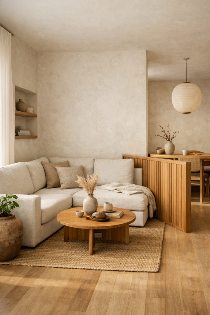
Takeaway: Sofa back under 30 inches, 40 percent of the width behind it left visible, rug stopping 12 to 18 inches short of the dividing line.
Use the sofa itself as the boundary between the living area and an adjacent dining or kitchen zone, with no wall required.
A sofa back is the least intrusive divider available, because it defines a zone at seated height while leaving everything above it open. You get separation without losing the light and sightlines that make an open plan worth having in the first place.
Keep the sofa back under 30 inches so it does not block sightlines or light between the zones, and position it so at least 40 percent of the width behind it stays visible from the dining or kitchen side. A sofa that blocks the view entirely has become a wall, which defeats the purpose.
A rug under the seating zone reinforces the boundary further. Stop it 12 to 18 inches short of the dividing line so there is a visible margin of bare floor between the two areas, which reads as a deliberate edge rather than a rug that ran out.
7. Window-Focused Layout
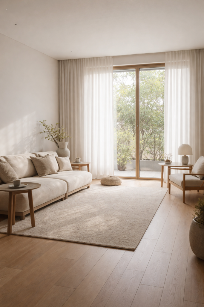
Takeaway: Primary seat 5 to 8 feet from the glass — connected to the view, clear of the glare. Sheer linen only.
Orient the seating toward the window and treat daylight and the view as the room’s focal point.
In Japandi, natural light is the most valuable material in the room, and this layout treats it accordingly. It also solves a problem: when a room has no fireplace and you do not want a television dominating the space, the window is the honest focal point, and orienting toward it removes the need to invent one.
Position the primary seat 5 to 8 feet from the window. That is close enough to feel connected to the view, and far enough that nobody sits in direct glare during peak sun hours, which is what makes window seating unusable in practice.
If the window faces the room’s main door, keep a 30-inch path clear between them so the layout does not force everyone to walk around the seating to cross the room.
Keep window treatments minimal. A sheer linen panel transmits most of the available daylight while providing privacy, where heavy drapery blocks the resource this entire layout is organized around.
8. No-Coffee-Table Layout
Takeaway: Two side tables under 16 inches wide, 18 to 22 inches from the sofa. Reclaims 20 to 30 inches of center-room clearance.
Remove the coffee table entirely and use side tables, a stool, or a low tray instead.
The coffee table is the single largest object in the middle of most living rooms, and in a narrow space it is the one blocking circulation. Removing it opens the floor in the place where openness is most visible, which is the center of the room.
Replace it with two side tables no wider than 16 inches, placed within arm’s reach of each seat, roughly 18 to 22 inches from the sofa edge. Keep their height within an inch or two of the sofa seat height so the horizontal line stays low and consistent.
This reclaims 20 to 30 inches of center-room clearance compared with a standard coffee table, which is why it is the right choice for any room narrower than 10 feet.
For the side tables, look for solid oak or walnut, a matte or oiled finish rather than lacquer, and a width under 16 inches. A pair of low solid-wood side tables costs less than most coffee tables and gives back the floor space that makes a narrow room work.
9. L-Shaped Sectional Layout
Takeaway: 8x8 ft footprint minimum plus 30 inches clearance on the open sides, back under 30 inches. Below 150 sq ft, use a sofa and a chair instead.
Use a low-profile L-shaped sectional to define the seating zone without additional pieces.
A sectional is the one large-footprint option that still suits Japandi, provided it stays low. Its advantage is that it seats several people using a single visual mass rather than four separate objects, which keeps the object count down even as the seating count goes up.
The footprint is the constraint. An L-shaped sectional needs a minimum of 8×8 feet for the seating alone, plus 30 inches of clearance on the two open sides. Keep the back height under 30 inches, because a tall sectional in an L-shape reads as a wall inside the room rather than as furniture.
Below 150 square feet this layout usually does not fit, and a sofa-plus-chair combination gives you the same seating count in less depth with the added benefit that the chair can move.
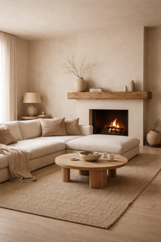
10. Fireplace-Centered Layout
Takeaway: Nearest seat 7 to 10 feet from the opening, all surrounding furniture below the mantel line, mantel itself nearly bare.
Arrange the seating around the fireplace and let the architecture supply the focal point.
When a room has a fireplace, it is already the focal point whether or not you plan for it, because the eye goes to the strongest architectural feature in the space. Arranging against it produces a room with two competing centers, which reads as unresolved.
Position the nearest seat 7 to 10 feet from the fireplace opening, both for heat comfort and so the sightline works without craning. Closer than 7 feet and a lit fire becomes uncomfortable; further than 10 and the arrangement stops feeling gathered.
Keep the surrounding furniture below the mantel height so nothing competes with the fireplace for attention. This is the practical version of letting one feature lead: if a bookshelf or a tall lamp rises above the mantel line, the eye has two places to go.
Keep the mantel itself nearly bare. One object, or none, is the Japandi move here.
11. TV Wall Minimal Layout
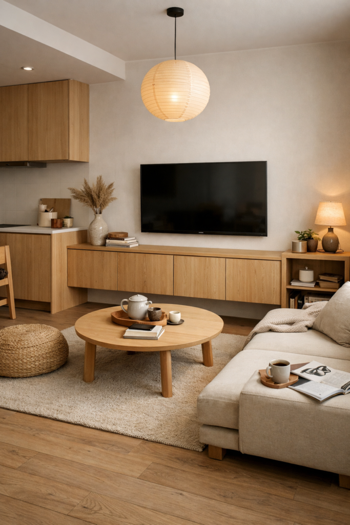
Takeaway: Screen center at 42 inches, not the standard 46 to 48 — you are sitting on a low sofa. Seating 1.5 to 2.5 times the diagonal away. Wall around it empty.
Mount the television on a clean wall with a low console beneath it and no surrounding clutter.
The television is the hardest object to reconcile with Japandi, because it is a large black rectangle that no amount of styling makes organic. The workable approach is to stop fighting it, mount it flush, keep everything around it empty, and let the negative space absorb it.
Viewing distance is roughly 1.5 to 2.5 times the screen’s diagonal. A 65-inch television wants seating 8 to 13 feet back; a 55-inch wants 7 to 11 feet. Sitting closer than that makes the screen dominate the room even when it is switched off.
Mount the screen so its center sits about 42 inches from the floor, which is eye height for a seated adult on a low Japandi sofa. Standard advice puts it at 46 to 48 inches, but that assumes taller Western-standard seating, and mounting to the usual height above a low sofa leaves you looking up.
Leave the wall around the television empty. Shelving, art, or storage flanking a screen creates a cluttered feature wall out of the one object you were trying to make recede.
12. Small Apartment Minimal Flow Layout
Takeaway: Map the 24-inch path first, then place furniture in what is left. Three pieces maximum. The path outranks the sofa.
In a compact apartment, prioritize the walking path over everything else and build the layout around it.
Every other layout here starts with the furniture and works outward. This one inverts that, because below a certain size the path is the binding constraint, and any arrangement that compromises it will feel wrong regardless of how good it looks.
Keep a single unbroken walking path at least 24 inches wide from the entry to the far side of the room. Map that path first, then place furniture in what is left.
Budget no more than three pieces: a sofa, one chair, and one slim table under 20 inches wide. A fourth piece in a small apartment almost always ends up in the path.
This is the one layout where the path outranks every other decision, including where the best spot for the sofa would otherwise be. If the ideal sofa position blocks the route, the sofa moves.
Common Layout Mistakes
Pushing everything against the walls. The instinct is to maximize floor space, but perimeter seating puts furniture in every route through the room and leaves a dead area in the middle. Concentrating furniture and leaving one clear zone works better.
Using furniture that is too tall. A layout can be perfectly measured and still feel wrong if the sofa back is 36 inches. Height blocks sightlines in a way that footprint does not.
Creating two focal points. A fireplace and a television on different walls, or a window view and a feature wall, force the seating to compromise between them. Choose one and let the other recede.
Ignoring the walking path until last. Most rooms that feel tight are not overfurnished, they contain exactly one piece in the wrong place. Map the path first.
Filling the center of the room. Negative space in the middle of a floor is doing real work in a Japandi room. A large coffee table plus an ottoman plus a floor cushion removes it..
Frequently Asked Questions
What is the best layout for a Japandi living room?
There is no single best layout, because the right one is decided by your room’s shape rather than by style preference. A square room of 12×12 feet or larger suits a centered low sofa or a symmetrical arrangement. A narrow room suits floating furniture or a no-coffee-table layout that reclaims center-room clearance. An open-plan space suits using the sofa itself as a divider. A room under 250 square feet suits corner conversation seating, which protects circulation by concentrating furniture in one area. If your room has a fireplace or a strong window view, that feature is already the focal point and the seating should orient toward it. Start with the decision table above rather than with a layout you liked in a photograph.
How much space do you need between a sofa and a coffee table?
Eighteen inches is the working minimum, measured from the sofa’s front edge to the nearest edge of the table. That is enough to step through comfortably and to reach the table from a seated position without leaning awkwardly. Below 18 inches people turn sideways to pass, and the room registers as tight even when nothing looks crowded. You can go up to about 24 inches before the table becomes too far away to use from the sofa. For walkways elsewhere in the room the numbers are different: a primary route, meaning one you use daily to enter or cross the space, wants 30 to 36 inches, while a secondary route can work at 24.
How do I lay out a small Japandi living room?
Map the walking path first and build everything else around it. Keep a single unbroken route at least 24 inches wide from the entry to the far side of the room, then place furniture in the space that remains. Limit yourself to about three pieces: a sofa, one chair, and one slim table under 20 inches wide, since a fourth piece in a compact room almost always ends up in the path. Pull the seating into a corner rather than spreading it around the perimeter, which concentrates the furniture and leaves one genuinely clear area. Keep every piece low, under 32 inches, so the wall above stays visible and the ceiling reads higher than it is.
Should the sofa face the window or the television?
Choose one focal point and commit to it, because a room organized around two competing centers reads as unresolved. If the view is good and you watch little television, orient toward the window and position the primary seat 5 to 8 feet back to stay clear of direct glare. If television is genuinely how the room gets used, mount the screen at about 42 inches to the center, sit 1.5 to 2.5 times the screen diagonal away, and keep the surrounding wall completely empty so the screen recedes when it is off. The one arrangement to avoid is splitting the difference, which usually produces a sofa angled awkwardly between the two and serving neither.
The Honest Answer
Japandi layout is not a matter of taste. It is clearances, sightlines, and one clear focal point, and those three things are measurable in a way that most interior advice is not.
Start with your room’s shape rather than with a photograph. Map the walking path before you place a single piece. Keep the furniture low so the wall above stays visible. Then choose the layout built for the space you actually have, and test it with what you already own before buying anything.
The best part of layout work is that it costs nothing. Every arrangement here can be tried in an afternoon, and the room will tell you within a day whether it is right.
Shop This Look
Laser distance measure — laser measure, 100ft · Every clearance rule in this post depends on knowing your actual dimensions.
Large area rug, 8×10 or 9×12 — wool or jute area rug · The rug defines the zone; size up from what feels right.
Felt furniture sliders — furniture moving sliders for hard floors · Lets you test arrangements without two people and a scratched floor.
Console table, narrow — narrow console table, solid wood · For behind a floating sofa. Under 14 inches deep.
Floor lamp, slim profile — arc or slim floor lamp, matte black · Lights a floating arrangement where no wall outlet reaches.
Extension cord, flat profile — flat under-rug extension cord · Floating furniture always creates a power problem. This solves it invisibly.
Adhesive cable channels — paintable cable raceway ·
Rug pad, felt and rubber — non-slip felt rug pad · A large rug under traffic needs it.
Felt floor protectors — heavy-duty felt pads ·

