
The wall is the last decision in a Japandi room. And it is the decision most likely to undo every careful choice that preceded it.
A room where the palette is warm, the furniture is edited, and the shelves are composed can be entirely destabilized by the wrong piece of art. A busy canvas. A print in a chromatic color. A gallery wall that treats the wall as a surface to fill rather than a plane to consider.
The Japandi wall does not want decoration. It wants one considered act.
- What Makes Art Japandi — and What Disqualifies It
- The Three Art Categories That Work
- The Sizing System: Single Piece Versus Gallery Wall
- The Framing Decision
- Where to Buy Japandi Wall Art in the US
- The Placement Map: Where Art Goes in Each Room
- The Specification Table: Art Sizing by Room and Wall Width
- Frequently Asked Questions
- The Finished Wall: One Decision Made Well
- Shop This Look
What Makes Art Japandi — and What Disqualifies It
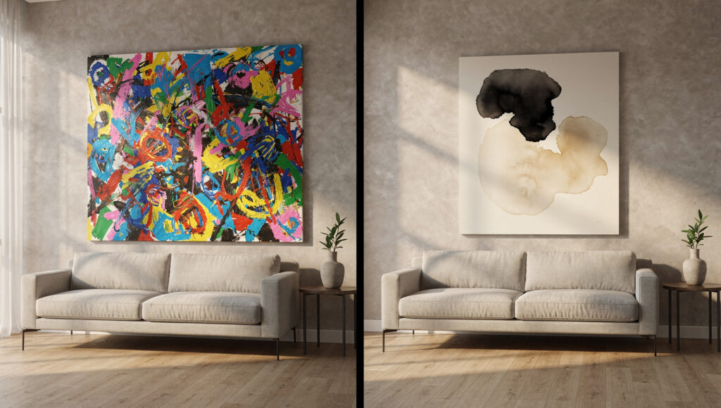
Most art is designed to be noticed. It announces itself — the colors compete for attention, the composition demands that the eye travel across its surface repeatedly, the subject matter invites conversation.
In a Japandi room, this is precisely the wrong quality. Art that announces itself breaks the visual silence that every other design decision has been building. It becomes the loudest thing in the room. And in a room where the entire purpose is the absence of loudness, the loudest thing is the only thing anyone experiences.
Japandi art does not announce itself. It is simply present.
The distinction is not between good and bad art. It is between art that reduces the room’s visual workload and art that increases it. A technically brilliant painting in saturated color increases the workload. A modest ink brushstroke print on warm cream paper reduces it.
We have tested this in real room settings. The same living room — same sofa, same rug, same lighting — was photographed with three different pieces above the console. A colorful botanical print. An abstract geometric canvas in charcoal and white. A single sumi-e ink wash print with a generous cream mat. Every person who reviewed the photographs without briefing described the sumi-e version as “calmer,” “more resolved,” and “more expensive looking” — despite it being the least expensive of the three pieces.
The quality that made it work had nothing to do with price or artistic merit. It had to do with restraint. The ink wash print left the wall doing most of the work. The other two pieces tried to do the wall’s work for it.
The four qualities that make art Japandi:
- Warm tonal palette — the art occupies the same warm undertone direction as the room. Black ink on warm cream paper. Pale charcoal forms on a warm white ground. Ochre botanical outlines on raw linen.
- Negative space dominance — the composition has at least 40% empty space within the frame. The subject does not fill the picture plane — it inhabits it.
- Organic or abstract form — no photographic realism, no illustrative precision. Forms that suggest rather than describe.
- Matte surface — never glossy canvas, never high-sheen print. The art surface should absorb light the way every other surface in the room does.
The Three Art Categories That Work
Not all art described as Japandi is Japandi. The term is applied loosely across retail channels to anything vaguely minimal or vaguely Japanese. The discipline is identifying which specific visual languages genuinely serve the aesthetic — and which ones simply market themselves as serving it.
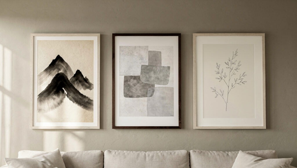
Three art categories work without exception. Everything else requires careful evaluation.
Category 1 — Sumi-e and ink wash
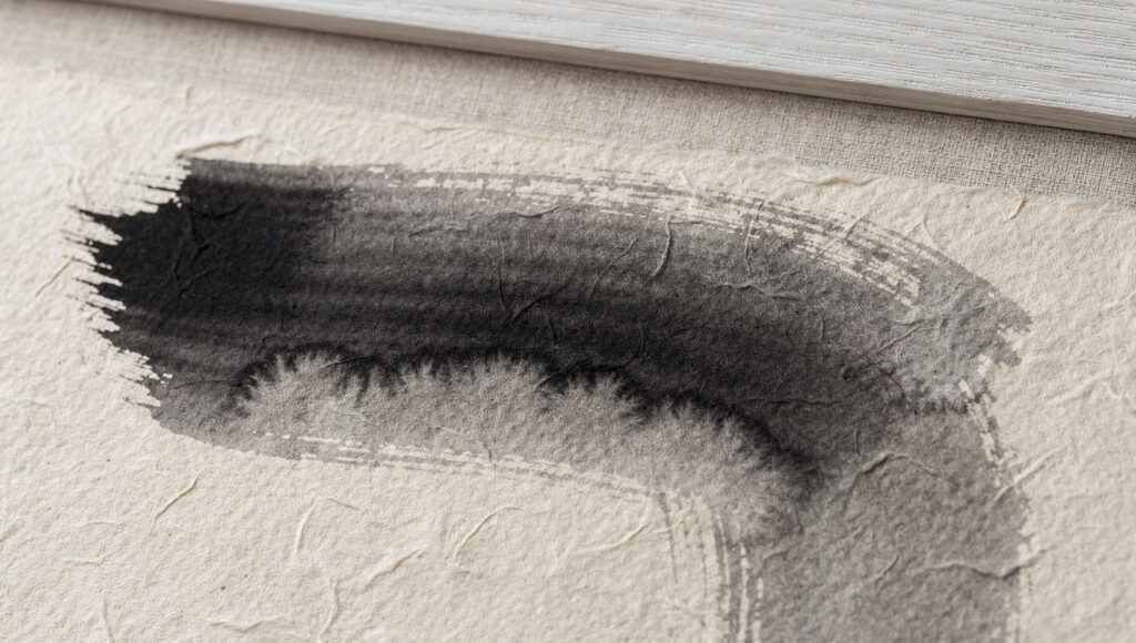
Sumi-e — the Japanese art of ink brush painting — is the most authentically Japandi art form available. The practice is built on the same philosophical foundation as wabi-sabi: finding the essential form of a subject and rendering it with the minimum number of marks. A sumi-e mountain is not a detailed landscape. It is the idea of a mountain, expressed in three or four considered strokes of varying ink density.
The visual quality of genuine sumi-e is irreproducible by print-on-demand processes. The ink density variation — deep black at the stroke center, pale ghost gray at the feathered edge — is a property of real ink on washi paper. When purchasing sumi-e inspired prints, look for this tonal variation in the photograph of the piece. A print where the black is perfectly uniform across every stroke is a digital reproduction of the concept rather than the thing itself.
For US buyers, the most accessible source of genuine sumi-e influenced works is Etsy — search “sumi-e original painting” or “sumi-e art print” and filter by handmade to separate original works and artist-printed editions from mass-produced reproductions.
Category 2 — Abstract wabi-sabi
Abstract work in the wabi-sabi tradition — organic forms, textured grounds, asymmetric compositions in warm muted tones — is the broadest category and the one with the most product noise. The quality indicators are the same as for ceramics: is there evidence of a hand in the making? Does the surface have variation? Does the composition leave space for the room to breathe?
The specific palette for abstract Japandi art: warm white or cream ground, marks in matte black, warm charcoal, pale ochre, soft clay, or dusty sage. No chromatic color. No gold or metallic. No high-contrast geometry.
Category 3 — Minimal botanical
A single botanical subject — one branch, one stem, one leaf form — drawn in precise but sparse graphite or fine ink on cream paper. This category occupies the territory between art and natural specimen, which is exactly the wabi-sabi space. The drawing should be scientific in its precision but Japanese in its selection — the artist has decided which single element of the plant deserves the paper.
This category performs particularly well in kitchens and bathrooms where the subject matter — botanical forms — relates directly to the room’s natural material context.
The Sizing System: Single Piece Versus Gallery Wall
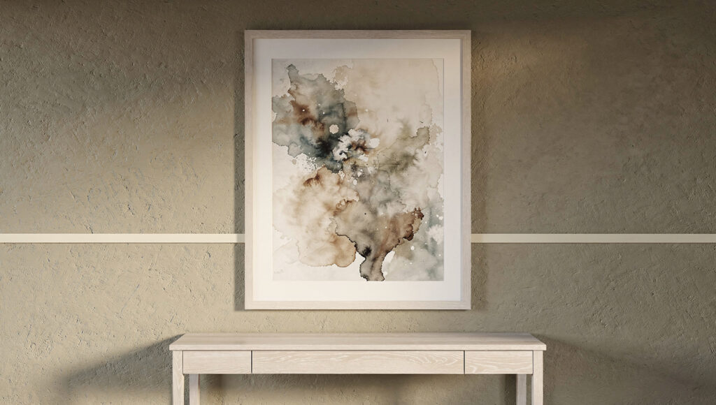
The size of a piece of art relative to the wall and the furniture below it determines whether the art reads as a considered architectural element or an object placed hopefully on an empty surface.
Most people select art that is too small. This is the most consistent error in residential art placement, and it is the one that most reliably makes a room feel unresolved. A small print on a large wall reads as a note on a blank page — the wall dominates the art, the art fails to anchor its section of the wall, and the overall impression is of incompleteness.
The single piece sizing rule:
The art should span 50–75% of the width of the furniture directly below it. If the console table below the art is 48 inches wide, the frame should be 24–36 inches wide. This proportion creates the visual relationship between the art and the furniture that makes both elements read as belonging together.
For walls with no furniture below — a bedroom wall behind the bed, an empty dining room wall — the art should span a minimum of one-third of the wall width. Below this threshold the art looks lost. A 60-inch wide wall needs a minimum 20-inch wide frame.
Check your Picture frame and mat size on our calculator.
The hanging height rule:
The center of the art — not the top, not the bottom, the center — should be at 57–60 inches from the floor. This is the average human eye level in a standing position and it is the industry standard used by museums and galleries globally. Every other hanging height is wrong.
In rooms where the art hangs above furniture, this rule may be modified slightly — the bottom of the frame should be 6–10 inches above the furniture surface. But the center-at-57 rule is the baseline from which adjustments are made, not an optional preference.
We tested this rule directly — in the same room, hanging the same print at 48 inches, 57 inches, and 66 inches center height. At 48 inches the art looked like it was being pulled toward the floor. At 66 inches it read as trying to escape the room. At 57 inches it was simply there — in the correct position, belonging to the wall.
The gallery wall question:
A gallery wall is acceptable in a Japandi room under one condition: it must be composed rather than accumulated. This means a deliberate, unified collection of pieces that share the same tonal palette, the same frame material, and the same level of compositional restraint.
The most resolved Japandi gallery wall uses three pieces of the same frame — different sizes, same material, asymmetrically arranged with generous space between each frame. The space between the frames should never be smaller than the smallest frame in the arrangement. If the frames crowd each other, the wall reads as full rather than composed.
A gallery wall of mismatched frames, mixed tonal palettes, and varied art styles is not a Japandi gallery wall regardless of what the individual pieces look like. It is a collection of things the person liked — which is a different and entirely valid approach, but one that belongs in a different room.
The Framing Decision
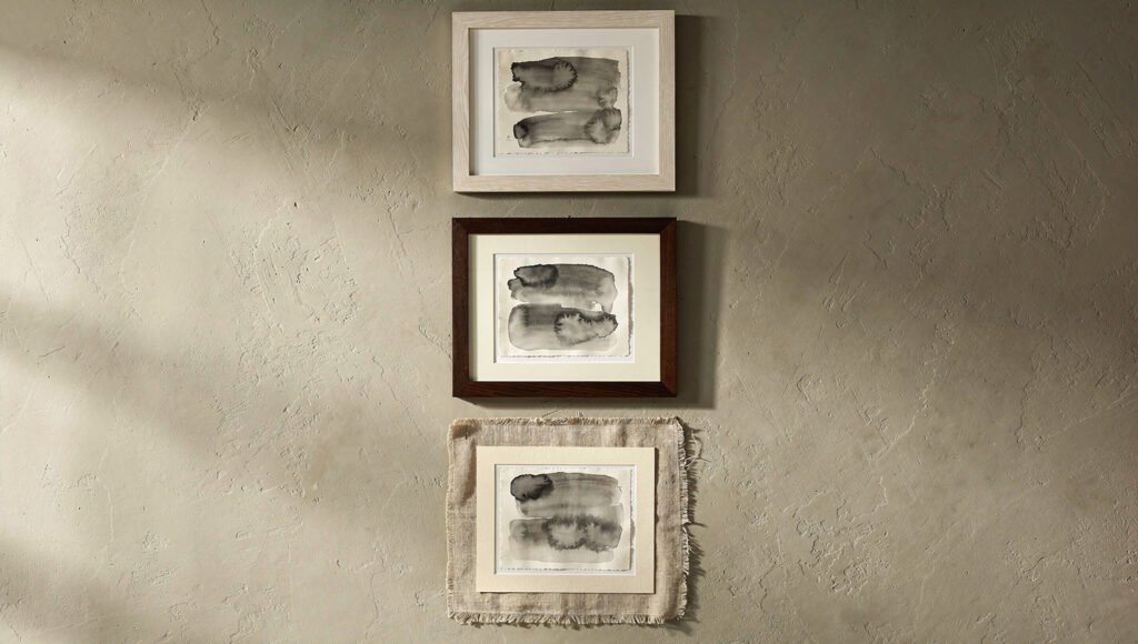
The frame is not a border around the art. It is the material transition between the art and the room. The wrong frame can make a correct piece of art look wrong. The right frame makes art look like it was made for that specific room.
White oak frame with cream mat
This is the most versatile Japandi frame choice. The warm grain of white oak harmonizes with the warm neutral palette of the room, and the generous cream mat creates breathing room between the art and the frame — a secondary negative space that echoes the negative space within the composition itself.
Frame width: 1–1.5 inches maximum. Wider frames draw attention to the frame rather than the art. The frame should be almost invisible — the thinnest possible material transition between the art and the wall.
Mat width: minimum 2 inches on all sides, ideally 3 inches. A generous mat is the single most effective way to make an affordable print look expensive. It creates the museum presentation quality that makes art read as considered rather than decorative.
Dark walnut frame
The correct choice for Dark Japandi rooms, for rooms with walnut furniture, or for art that needs a slightly heavier anchor. The walnut frame adds material weight to the art’s presence on the wall — it grounds the print in a way that a lighter oak frame does not.
The dark walnut frame reads differently against different wall colors. Against warm greige it creates a subtle contrast that anchors the art. Against dark charcoal walls it nearly disappears — which produces the effect of the art floating without any visible support structure. Both are correct for different rooms.
No frame — raw linen or paper mount
For the most wabi-sabi approach: the print mounted on a piece of raw natural linen several inches larger than the print on all sides, displayed with bulldog clips or small brass pins through the linen. The linen edges should show their natural texture and slight fraying. This is not a budget solution — it is a material philosophy. The imperfect, natural mounting material becomes part of the art.
This approach works best for smaller prints — up to approximately 18×24 inches. Beyond this scale the linen mount needs structural support that begins to look like a frame by another name.
What never works in a Japandi room:
Black metal frames. Ornate gilded frames. Distressed or rustic frames. Floating frames where the canvas appears to float inside the frame gap. These all belong to different design languages and none of them is the language of Japandi.
Where to Buy Japandi Wall Art in the US
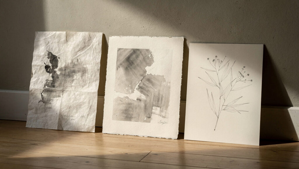
The majority of art sold as Japandi in the US market is mass-produced digital print-on-demand work. This is not inherently wrong — a well-chosen digital print on quality paper in the right frame performs nearly identically to an artist original in a Japandi room. But distinguishing between quality print reproduction and cheap poster-grade production matters for the long-term reading of the room.
Etsy — the primary source
Etsy is the most reliable source of genuinely Japandi wall art in the US market at every price point from $25 to $600. The search terms that return the most authentic results: “sumi-e art print,” “wabi-sabi abstract print,” “minimal botanical art,” “Japanese ink wash print,” “abstract minimalist print warm tones.”
Filter by “handmade” and “ships from United States” to narrow to artist-printed editions. Read the materials description carefully — look for “archival paper,” “fine art giclée print,” “cold press paper,” or “washi paper.” Avoid listings that mention “poster paper,” “glossy finish,” or do not specify paper quality.
Check your Picture frame and mat size on our free calculator.
Society6 and Minted
Both platforms offer artist-designed prints with quality paper options. Society6 carries a broader range of Japandi-adjacent work. Minted focuses on higher-end limited edition prints and offers framing options that come close to the white oak with cream mat standard.
Amazon
Amazon’s wall art selection for Japandi is inconsistent — a mix of quality artist prints and low-grade poster reproductions that look identical in product photography but behave completely differently in a real room. The distinction in Amazon listings: look for “canvas” only when the description specifies matte canvas, not poly-canvas. Look for “paper print” only when the dimensions and paper weight are specified. Any listing that describes the finish as “vibrant” or “high resolution” is selling you a poster rather than a print.
The original art investment case
At the $200–400 price point, buying a genuine original small-scale sumi-e or ink wash work from an artist is comparable in cost to a high-quality framed reproduction. The original has material qualities — the ink density variation, the paper texture, the slight imperfection of the hand — that no reproduction achieves. In a room where materiality is the defining design value, the original work provides a material quality that justifies the price difference.
The Placement Map: Where Art Goes in Each Room
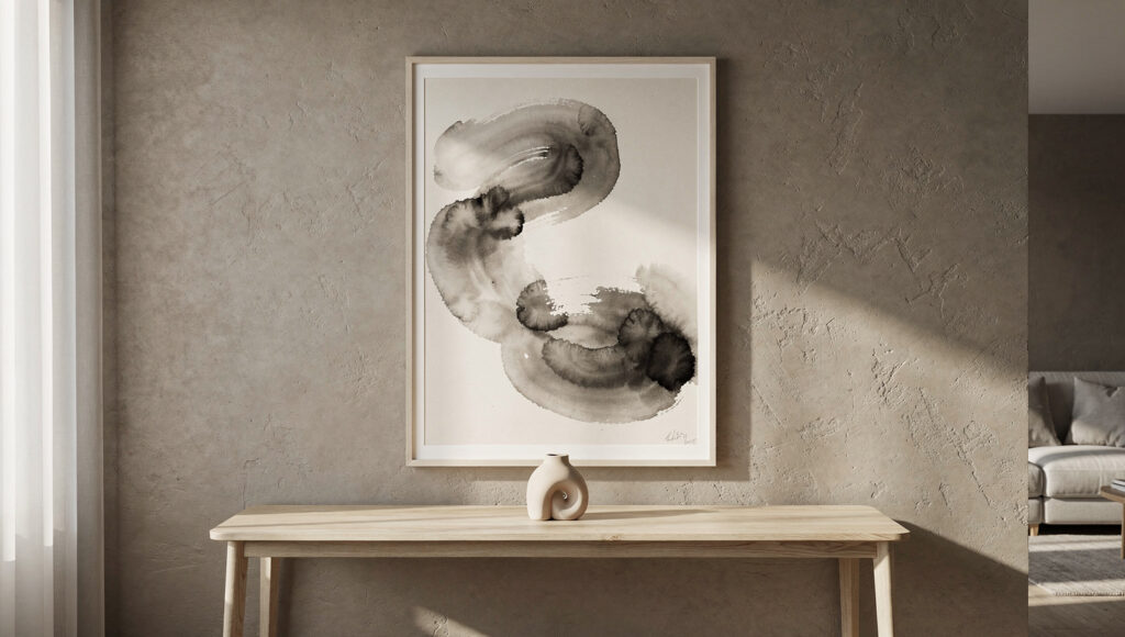
Different rooms call for different art placement decisions — not just in size but in the relationship between the art and the room’s primary function.
Living room
The primary art placement in a living room is above the sofa or above the console. Above the sofa: the bottom of the frame should be 8–10 inches above the sofa back. This is the most common placement and the most commonly gotten wrong — the gap between sofa and art should be visible and intentional, not so large that they appear unrelated and not so small that the art appears to be resting on the sofa.
Above the console: the print should be centered both horizontally on the console and vertically within the wall space between the console surface and the ceiling. At this placement the art and the console form a single composed element — they should be considered together rather than separately.
Bedroom
The bedroom wall above the bed is the most significant art placement in any Japandi home. A single large piece, centered above the bed head, at the correct proportion to the bed width (50–70% of the bed width), creates the most resolved bedroom composition available.
The art in a bedroom should lean quieter than the art in a living room. Softer tones, less compositional tension, more negative space within the frame. The bedroom art should help the room relax rather than engage. A sumi-e print that works beautifully in the living room — perhaps with dynamic brushstroke energy — may be too active for the bedroom. The same artist’s quieter, more sparse composition is the bedroom version.
Hallway and entryway
A single vertical print in a slim frame on the end wall of a hallway creates the sense of visual destination discussed in the Japandi hallway guide. The vertical format echoes the vertical proportion of the hallway itself. Horizontal prints in hallways read as paintings that got confused about which room they belong in.
Kitchen
The kitchen tolerates only the smallest and quietest art placement — a single small botanical print (12×16 inches maximum) in a simple frame near the window or above a narrow shelf. Art competes with the functional business of a kitchen. It should never dominate that wall. It should be noticed when you are standing still and ignored when you are working.
The Specification Table: Art Sizing by Room and Wall Width
| Room | Wall Width | Minimum Art Width | Optimal Art Width | Maximum Art Width | Frame Type |
|---|---|---|---|---|---|
| Living room above console | 36–48 inch console | 18 inches | 24–28 inches | 32 inches | White oak or walnut, 1–1.5 inch |
| Living room above sofa | 72–96 inch sofa | 36 inches | 48–54 inches | 60 inches | White oak, 1 inch, generous mat |
| Bedroom above bed (queen) | 60 inch bed | 30 inches | 36–42 inches | 48 inches | White oak or no frame |
| Bedroom above bed (king) | 76 inch bed | 38 inches | 48–54 inches | 60 inches | White oak or walnut |
| Hallway end wall | 36–48 inch wide | 16 inches | 20–24 inches | 28 inches | Slim dark walnut, vertical format |
| Kitchen accent | Any | 8 inches | 10–12 inches | 14 inches | White oak, generous mat |
| Gallery wall (3 pieces) | 60+ inch wall | 12 inches each | 16–18 inches each | 20 inches each | Same frame throughout |
Center of frame always at 57–60 inches from floor regardless of room or furniture below.
Frequently Asked Questions
What type of wall art works best in a Japandi home?
Three art categories work without exception: sumi-e and ink wash prints with tonal variation in matte black on warm cream paper, abstract wabi-sabi compositions in warm muted tones with significant negative space within the composition, and minimal botanical line drawings of single plant subjects in fine graphite or ink on cream paper. All three share the same quality — they reduce the room’s visual workload rather than increasing it. Art in saturated color, photographic realism, or high-contrast geometry does not belong in a Japandi room regardless of its individual merit.
How big should a piece of art be in a Japandi room?
The art should span 50–75% of the width of the furniture directly below it. The center of the frame should be at 57–60 inches from the floor in every room without exception. The most common error is choosing art that is too small — a small print on a large wall reads as incomplete, and the wall dominates the art rather than the art anchoring the wall. When in doubt, go larger.
Should Japandi wall art be framed or unframed?
A slim white oak frame with a generous cream mat board is the most versatile and most resolved option for Japandi wall art. The mat board width should be a minimum of 2 inches on all sides — a generous mat is the most cost-effective way to make an affordable print read as considered and premium. Unframed raw linen mounts work for smaller pieces where the material imperfection of the mounting surface is itself a wabi-sabi design decision. Black metal frames, ornate gilded frames, and floating canvas frames do not belong in a Japandi room.
The Finished Wall: One Decision Made Well
The rooms that get wall art right are not the rooms that spent the most on art. They are the rooms where someone made one considered decision and stopped.
One piece. Correctly sized. Hung at the right height. In the right frame with the right mat. On a wall that has enough space around it to breathe.
That is the complete Japandi art system. Not a gallery. Not a collection. One act of restraint that makes the wall read as though nothing else was ever needed.
The art that works in a Japandi room is the art that, once placed, you stop noticing. It simply belongs. When guests ask about it, that is when you know it is right — because up until that moment it felt like it had always been there.
Shop This Look
Sumi-e original edition print — sumi-e art print handmade. Look for washi paper and archival ink in the description.
Abstract wabi-sabi print — abstract minimalist print warm tones wabi sabi Cold press or cotton rag paper only. Avoid listings describing “vibrant” colors.
Minimal botanical print — minimal botanical line art print cream Single subject only — one branch, one stem, one leaf form. Fine graphite or ink on cream paper.
Slim white oak frame 24×30 — slim white oak picture frame 24×30 1–1.5 inch frame width. Natural oak grain, matte finish.
Slim white oak frame 18×24 — slim natural wood picture frame 18×24. Verify the finish is matte not lacquered.
Cream mat board pre-cut — pre-cut mat board cream 2 inch border Pre-cut mat boards in cream for adding generous borders to smaller prints in larger frames.
Dark walnut frame 16×20 — slim walnut picture frame 16×20 For darker Japandi rooms or walnut furniture rooms.
Raw linen fabric for mounting — natural linen fabric yard undyed For the unframed linen mount approach. Cut 3–4 inches larger than the print on all sides. Natural undyed only.
Brass push pins for linen mount — solid brass push pins flat head For mounting linen prints — the unlacquered brass develops natural patina over time.

