
This post contains a couple of affiliate links. If you buy through them, Homeoration earns a small commission at no extra cost to you.
A north-facing room gets the coolest, most even daylight in your home, with no direct sun to warm it. Left alone, that light pulls blue: crisp whites read grey, and cool grays read like wet concrete. The fix is warmer pigment set at a high enough light reflectance to bounce the little light you get. This guide gives you seven verified warm-minimalist colors for northern light, the exact LRV for each, and the shades to skip.
The short answer
For a north-facing room, choose warm neutrals with a yellow, green, or soft pink undertone and an LRV above roughly 55, so they reflect the cool, indirect light. White Dove (LRV 85) and Pale Oak (68.6) are the safest picks. Skip stark pure whites and blue-based grays.
- Why north-facing light changes your paint
- The palette at a glance
- The two warm whites that hold up in north light
- The warm greiges that add grounding without going dark
- The mid-tone anchor, and when to use it
- When you stop fighting the light: warm greens
- The colors to skip in a north-facing room
- How to test before you commit
- Which color should you choose
- What to actually buy
- Frequently Asked Questions
- Closing
Why north-facing light changes your paint
Takeaway: North light is cool, even, and sunless. Counter it with warm undertones (yellow, green, soft pink) and, in most rooms, an LRV above 55. Temperature and reflectance are two separate decisions, and you need both right.
Every room faces a direction, and that direction sets the temperature of the light before your paint ever enters the picture. South-facing rooms get warm, direct sun for most of the day. West rooms get golden afternoon light. North-facing rooms get neither. They receive steady, shadowless daylight from the cool end of the spectrum, and because there is no direct sun, that light never warms up.
Two things follow from this, and both matter for a warm minimalist room where the whole point is a calm, grounded warmth.
First, cool undertones get colder. A gray with a blue base that looks balanced in a bright showroom will drift toward slate or lavender on a north wall. A white with no warmth in it goes flat and slightly grey. The room stops reading as “quiet” and starts reading as “cold.”
Second, light reflectance does more work than usual. LRV, or Light Reflectance Value, is the percentage of light a color bounces back, on a scale from 0 (black) to 100 (pure white). In a bright south room you can use a low-LRV color and the sun will carry it. In a north room there is no sun to carry anything, so a higher LRV keeps the space from feeling dim and closed in. This is why the same greige can look airy in one room and muddy in another.
The warm minimalist answer is to work with both levers at once: pick a warm undertone so the color does not go cold, and pick an LRV high enough to keep the room open. The seven colors below are chosen on exactly those two criteria.
The palette at a glance
| Color | Code | LRV | Undertone | North-facing verdict |
|---|---|---|---|---|
| White Dove | BM OC-17 | 85 | soft warm, slight yellow-green | Best all-round warm white; bounces the most light |
| Alabaster | SW 7008 | 82 | warm, creamy | Softer than White Dove; use if White Dove reads cool to you |
| Pale Oak | BM OC-20 | 68.6 | greige, faint pink-green | Top light greige for north; adds warmth without going dark |
| Accessible Beige | SW 7036 | 57.7 | warm greige, taupe | Grounds the room; shows more gray in low light, so sample it |
| Revere Pewter | BM HC-172 | 55 | greige, green | Deeper anchor; can go slightly olive in flat north light |
| Saybrook Sage | BM HC-114 | 46 | muted warm green | Commit to color; behaves like a warm neutral |
| Evergreen Fog | SW 9130 | 30 | warm gray-green | Moody and cocooning; embrace the low light instead of fighting it |
All LRVs above are manufacturer values. Always sample on your own wall before committing, because your flooring, wood tones, and light bulbs shift every one of these.
The two warm whites that hold up in north light
Takeaway: In north light, warm white beats pure white every time. Start with White Dove (LRV 85). Switch to Alabaster (82) only if White Dove reads cool against your floors.
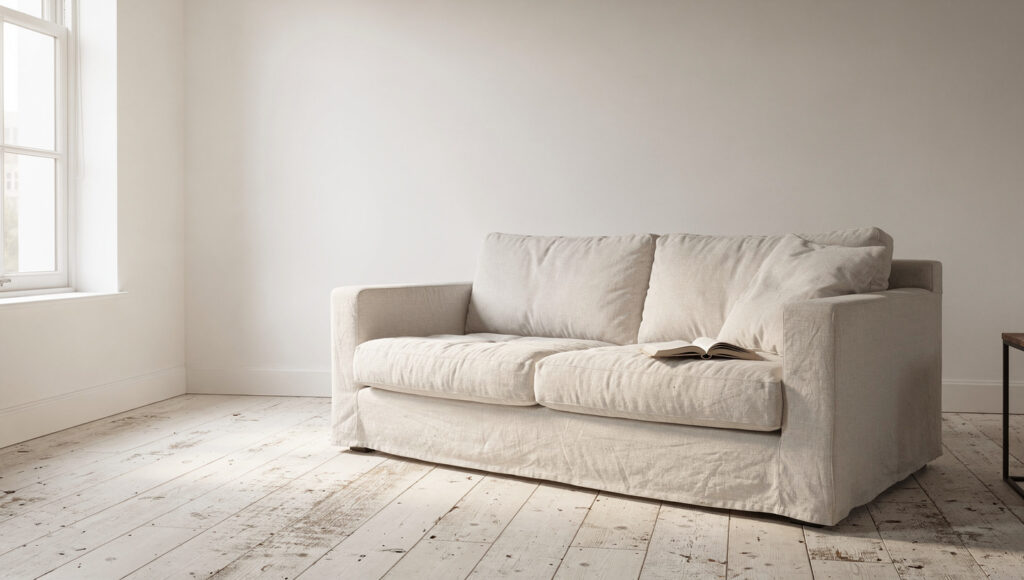
Most people reach for the whitest white to brighten a dark room. In north light that backfires. A pure, blue-based white has no warmth to reflect, so it reads grey and lifeless. You want a white with enough pigment to stay warm while still sitting high on the LRV scale.
Benjamin Moore White Dove OC-17 (LRV 85) is the safest warm white in the US market for a reason. It carries a slight yellow-green softness that keeps it from going cold, and at LRV 85 it reflects nearly all the light a north room gives it. It works with blonde oak and dark walnut alike, which is why it anchors so much warm minimalist and Japandi work. If you want one white that will not embarrass you in northern light, this is it.
Sherwin-Williams Alabaster SW 7008 (LRV 82) is the creamier alternative. It has a touch more warmth than White Dove and reads softer, almost like unbleached linen. Choose it if White Dove ever looks slightly cool or grey in your particular room, which can happen when your floors are cool-toned.
For maximum calm, painting the walls, trim, and ceiling in the same warm white removes the hard shadow lines a north room already struggles to produce. The room becomes one soft envelope of light rather than a box with a bright ceiling and duller walls.
The warm greiges that add grounding without going dark
Takeaway: For warm color that still reflects light, Pale Oak (68.6) is the north-facing default. Accessible Beige (57.7) grounds a room more but needs testing in low light, where it can read heavier.
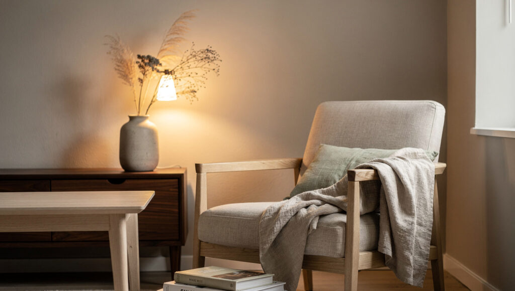
If white feels too stark for the mood you want, a warm greige gives you quiet color and a little more depth while keeping the room light. The trick in north light is to stay warm and stay reasonably high on the LRV scale.
Benjamin Moore Pale Oak OC-20 (LRV 68.6) is the standout here. Colorists repeatedly reach for it in dim and north-facing rooms because it behaves like a warm off-white in good light and settles into a soft greige when the light drops, without ever turning cold. Its faint pink-green base is what keeps it friendly rather than flat. If you want “barely there warmth” on a north wall, Pale Oak is the pick. (If you want a touch more pink warmth still, Muslin OC-12 at LRV 66.5 sits in the same lane.)
Sherwin-Williams Accessible Beige SW 7036 (LRV 57.7) grounds a room more firmly. It is a genuine warm greige with a taupe base, and it gives you that cocooning, layered feeling warm minimalism is built on. The honest caveat: at LRV 58 it sits on the lower edge of “light,” so in a genuinely dim north room it can show more of its gray side and feel heavier than the swatch suggests. Sample it on the darkest wall, not the brightest.
Pair either greige with white oak for lightness or walnut for weight, and keep to two wood species at most. The wood is doing as much of the warming as the paint.
The mid-tone anchor, and when to use it
Takeaway: Revere Pewter (55) is your anchor when you want depth and have enough daylight to carry it. In a very dark north room it can slide toward olive, so test it hard before you commit a whole room.
Benjamin Moore Revere Pewter HC-172 (LRV 55) is the most-sold greige of the past decade, and it earns a place here with one clear condition. It is a warm greige with a green base that gives a room real depth, and it is the right call when you want the walls to anchor lighter furniture rather than disappear.
The condition: in flat north light Revere Pewter can pick up a slightly olive or gloomy cast, because that green undertone has no warm sun to balance it. It shines in a north room that still gets a decent amount of daylight, or when you are deliberately going for a snug, saturated look. In a small, genuinely dark north room, it will feel heavier than you expect. This is the color where sampling is not optional.
When you stop fighting the light: warm greens
Takeaway: If a north room is dark no matter what, embrace it. Saybrook Sage (46) gives color while staying livable; Evergreen Fog (30) commits fully to a warm, moody room. Both behave like neutrals in a warm minimalist scheme.
There is a second, quieter strategy for north-facing rooms. Instead of brightening against the cool light, you lean into it and let the room go moody and enveloping. Warm greens do this beautifully, because green is the one saturated color that still reads as a natural, restful neutral in the warm minimalist and Japandi vocabulary.
Benjamin Moore Saybrook Sage HC-114 (LRV 46) is a muted, dusty green that functions like a warm neutral. At LRV 46 it holds enough light to stay livable in a north room while giving you real color on the wall. It sits especially well behind a bed or in a study, paired with oak and cream linen.
Sherwin-Williams Evergreen Fog SW 9130 (LRV 30) goes further into the mood. It is a warm gray-green that turns a dim north room into an intentional, cocooning space rather than an accidentally dark one. At LRV 30 you are committing to a darker room, so this works best where you were never going to win the brightness battle anyway: a north-facing snug, a home office, a powder room. Color-drenching the trim and ceiling to match makes the low light feel like a choice.
The colors to skip in a north-facing room
Takeaway: Skip pure whites (Chantilly Lace, LRV 92), blue-based grays, and cool blues and greens on north walls. Each one gets colder in northern light, which is the opposite of what warm minimalism is after.
A few categories reliably disappoint on a north wall, and knowing them saves you a repaint.
Stark, pure whites. A high-purity white like Chantilly Lace OC-65 (LRV 92) is stunning in a bright, sunny room. In north light, with nothing warm to reflect, it flattens and can look faintly grey or clinical. Save it for trim or a south-facing space, and use White Dove or Alabaster on your north walls instead.
Blue-based and cool grays. Any gray with a blue undertone will read colder and can shift toward lavender or slate on a north wall. If you love gray, choose a warm greige (like the three above) rather than a true cool gray.
Cool greens and cool blues. Paint experts consistently flag these for north rooms, because the already-cool light drains them further and the result feels chilly rather than calm. If you want green, keep it warm and muted, as with the two greens above.
How to test before you commit
Takeaway: Sample big, sample on the real walls, and check morning, noon, and night under your own bulbs. Then swap cool bulbs for warm 2700-3000K light so your paint stays warm after sunset.
Every LRV and undertone note in this guide is a starting point. Your room will change all of them, so test properly.
Buy peel-and-stick samples or paint two coats onto large white poster board, and move the boards to different walls. Never judge a north-facing color off a tiny chip or a phone screen. Look at each option in the morning, at midday, and in the evening under your actual bulbs, because a warm white that looks perfect at noon can turn yellow or grey by lamplight.
One more lever that matters more in north rooms than anywhere else: your light bulbs. Cool, high-Kelvin bulbs push a north room further blue and undo your warm paint. Use warm-white bulbs in the 2700K to 3000K range with a high color-rendering index, and your warm neutrals will hold their warmth after dark.
Which color should you choose
The right pick depends on the room and what you want it to do.
North-facing living room: Pale Oak (68.6) for warm, light walls that keep the space open, or White Dove (85) if you want it brighter and cleaner. Add walnut and oak to warm it from the floor up.
North-facing bedroom: This is where you can push color safely. Saybrook Sage (46) or Accessible Beige (57.7) behind the bed reads calm and grounded, especially color-drenched with matching trim.
North-facing kitchen: White Dove (85) or Alabaster (82) on walls and upper cabinets keeps a working room light, with a warmer greige or muted sage on the lower cabinets for a grounded two-tone look.
North-facing home office or snug: Go moody on purpose. Evergreen Fog (30) or Revere Pewter (55) makes a small, dim room feel intentional and focused rather than dark by accident.
If you are still deciding between the whole family of warm neutrals here, our warm minimalism guide walks through how these colors sit alongside wood, black accents, and layered light. For the Japandi-specific version of this palette, see our Japandi paint colors, Japandi color palette, Sage green paint colors and White Dove vs Alabaster vs Chantilly Lace guides.
What to actually buy
Paint itself is a Benjamin Moore or Sherwin-Williams store purchase, so there is nothing to link there. Two adjacent things are worth buying online before you paint, and both have genuine intent for a north-facing project:
- Peel-and-stick real-paint samples: North light is the exact situation where a chip lies to you, and moving a real-paint sample around the room is the whole test.
- Warm-white LED bulbs, 2700-3000K, CRI 90+: This is what stops your warm paint from turning blue after dark. GE Reveal and Philips warm-white lines both list these specs.
- A physical fan deck (the BM or SW deck) if you are choosing colors for a whole home, not one room. Lower intent, but useful for serial painters.
No hardware, no decor, and no furniture belongs on this page. Sending a paint-color reader to a sofa listing breaks trust and converts nothing.
Frequently Asked Questions
What is the best paint color for a north-facing room?
The single safest choice for a north-facing room is Benjamin Moore White Dove OC-17, a warm white with an LRV of 85. Its slight yellow-green softness keeps it from reading cold in cool northern light, and its high light reflectance bounces the limited daylight a north room receives. If you want quiet color rather than white, Pale Oak OC-20 at LRV 68.6 is the next safest pick, behaving like a warm off-white in good light and a soft greige when the light drops. Both work with warm and cool wood tones, which is why they anchor most warm minimalist rooms. Whatever you choose, sample it on your own wall first.
Should north-facing rooms be light or dark?
Either can work, and the choice is about intent rather than a rule. If you want the room to feel bright and open, use a warm white or light greige with a high LRV, such as White Dove at 85 or Pale Oak at 68.6, to reflect the cool light. If the room is genuinely dark and you would rather stop fighting it, lean into the low light with a warm, moody color like Evergreen Fog at LRV 30, and color-drench the trim and ceiling to match. The mistake is choosing a pale, cool color that goes flat and grey. A committed warm color, light or dark, always reads better than a washed-out cool one.
Why do north-facing rooms look cold?
North-facing rooms look cold because they receive steady daylight from the cool end of the spectrum and never get direct sun to warm it up. That blue-leaning light drains warmth from your paint, so whites read grey and cool grays turn slate or lavender. The effect is strongest with colors that have no warm pigment to reflect, which is why pure whites and blue-based grays fail on north walls. The fix is to add warmth back with your paint and your bulbs: choose colors with yellow, green, or soft pink undertones, keep the LRV high enough to bounce light, and use warm-white 2700-3000K bulbs so the room stays warm after dark.
Is Revere Pewter good for north-facing rooms?
Revere Pewter HC-172 can work in a north-facing room, with one condition. It is a warm greige with a green undertone and an LRV of 55, which gives a room welcome depth and anchors lighter furniture. The catch is that in flat, sunless north light its green base can pick up a slightly olive or gloomy cast, because there is no warm sun to balance it. It performs best in a north room that still gets a fair amount of daylight, or when you are deliberately going for a snug, saturated look. In a small, genuinely dark north room it will feel heavier than the swatch suggests, so sample it on the darkest wall before committing.
What paint colors should you avoid in a north-facing room?
Avoid three groups on north walls. First, stark pure whites such as Chantilly Lace OC-65 at LRV 92, which lose their crispness and read grey or clinical without warm light to reflect. Second, blue-based and cool grays, which shift toward slate or lavender and feel colder than intended. Third, cool blues and cool greens, which the already-cool light drains further, leaving the room chilly rather than calm. In each case the problem is the same: a cool color gets colder in northern light. If you want white, choose a warm one; if you want gray, choose a warm greige; if you want green, keep it warm and muted.
Closing
North-facing rooms have a reputation for being difficult, but the logic is simple once you separate the two decisions. Pick a warm undertone so the color does not go cold, and pick an LRV that matches how bright you need the room to feel. Everything in this guide, from White Dove at 85 down to Evergreen Fog at 30, follows those two rules. Sample your top two or three on the real walls, swap in warm bulbs, and let the room tell you which one it wants.

