
This post contains affiliate links. If you purchase through these links, Homeoration earns a small commission at no extra cost to you – it helps keep this content free.
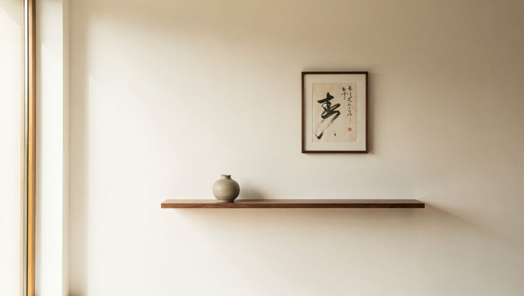
Most wall decor advice treats the wall as a surface to fill. That instinct is exactly what breaks a Japandi room. Every other guide hands you a list of things to hang; almost none explain why a Japandi wall so often works best with a single object and a wide field of nothing around it. The reason is a design principle, not a shortage of ideas.
In Japanese design, Ma is the considered interval, the deliberate gap between things. A blank wall is not a problem waiting for a solution. It is the pause that lets everything else register, the silence that makes the one right object read as intentional rather than lonely. As I covered in the Japandi living room ideas guide, the whole style runs on functional minimalism, where each element earns its place by doing something for the atmosphere. Wall decor is where that discipline is hardest to hold, because filling a wall feels productive even as it quietly ruins the room.
This guide works from the wall surface outward: the finish first, then the single large gesture, then the tactile and functional layers that give a spare room its warmth. My bias, stated plainly, is toward fewer and better. A Japandi wall is built by subtraction, and the goal throughout is a wall that feels composed rather than decorated.
- Wall Treatments at a Glance
- The Wall Itself: Limewash and Clay Texture
- The Single Large Piece: Scale Over Quantity
- Wood Slat Panels and Acoustic Walls
- Soft Materials: Woven Wool and Linen Hangings
- The Single Branch: Wall-Mounted Ikebana
- Shelves, Niches, and the Edited Display
- Mirrors That Borrow the Light
- Ink and Paper: Art the Japandi Way
- Common Mistakes That Break the Look
- Frequently Asked Questions
- The Finished Wall
- Shop This Look
Wall Treatments at a Glance
Before the detail, here is how the main approaches compare. Read it as a menu, not a to-do list. Most rooms need one or two of these, never all of them.
| Approach | What it does | Best wall | Effort and cost | Sound benefit |
|---|---|---|---|---|
| Limewash or clay plaster | Adds living texture, often removes the need for art | Any large blank wall | Moderate, DIY-friendly | None |
| Felt-backed wood slat panel | Linear rhythm, warmth, sound damping | Behind the sofa or TV | Higher, panels plus install | High |
| Woven wool wall hanging | Softens echo, adds tactile warmth | Above a low sofa | Low to moderate | Moderate |
| Single oversized canvas | One grounding focal point | The main sightline wall | Varies by size | None |
| Organic mirror | Borrows daylight and the view outside | Opposite a window | Low to moderate | None |
| Floating walnut shelf | Displays a small edit without clutter | A secondary wall | Low | None |
The rest of this guide takes each and explains how to execute it so it reads as deliberate.
The Wall Itself: Limewash and Clay Texture
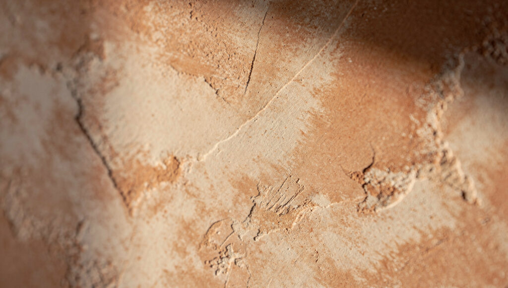
Before you hang anything, look hard at the surface you are about to cover. In many rooms the best wall decor is the wall. A flat, roller-painted surface reflects light evenly and reads as blank. A mineral finish behaves differently. Limewash and clay plaster scatter light across a subtly mottled surface, so the wall shifts in tone through the day as the sun moves. That movement is decor, built into the finish rather than hung on top of it.
The two finishes are worth telling apart. Limewash is a breathable, lime-based coating that goes on thin and dries into soft cloudy variation, aging gracefully over years. Clay plaster is thicker, troweled in layers, holding a matte suede depth. Roman clay sits between them: a water-based, clay-pigmented plaster applied in thin passes, each leaving faint tool marks that catch raking light. In a deep charcoal or a warm clay tone, none of these look painted. They look as though the wall was always that color.
If you want to try it, look for a mineral limewash interior paint ; the ones worth buying are genuinely lime-based and breathable, publish a coverage rate per coat, and sell sample pots so you can test how the color dries, which is usually two shades lighter than it looks wet. For a deeper troweled surface, a tintable clay plaster gives more texture, though it rewards a practiced hand.
My honest view: with a limited budget and one big wall, spend it here before you spend it on art. A textured wall with nothing on it beats a flat wall with a mediocre print. The texture is quiet, permanent, and impossible to fake with a frame.
The Single Large Piece: Scale Over Quantity
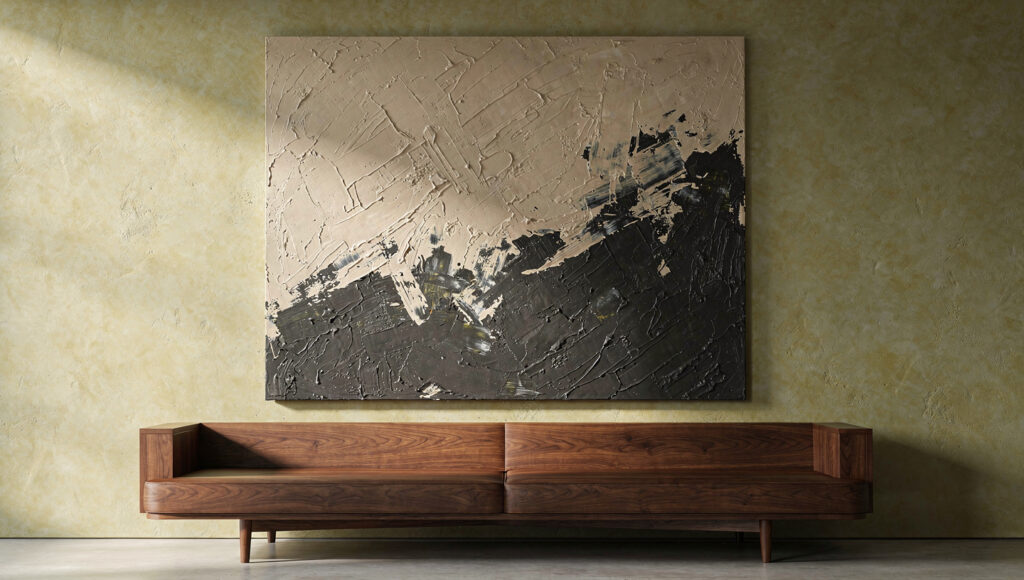
When people face a big empty wall, the reflex is a gallery wall of ten small frames. In a Japandi room that backfires. Ten frames make ten focal points, and ten focal points read as the visual noise the style exists to remove. The alternative is one piece, deliberately oversized, that anchors the wall and lets everything around it stay quiet.
Scale is the whole game. A useful editorial rule is that a single artwork should span roughly two-thirds to three-quarters of the furniture beneath it. A modest frame over a wide low sofa looks like it wandered onto the wrong wall. If you are unsure what size to order, the picture frame size calculator on the site turns your wall and sofa dimensions into a target artwork size before you buy.
For the piece itself, a textured monochromatic abstract works well: thick impasto strokes in sand, oat, or charcoal, where the interest lives in the surface and tone rather than any subject. This is the same logic behind the heavy, grounding focal points in the Dark Japandi living room palette. Because choosing framed art is a topic of its own, from paper stock to frame profile, the deep dive lives in the dedicated Japandi wall art guide. Here the point is narrower and more important: one large piece, correctly scaled, does more than a dozen small ones.
My rule of thumb: choosing between two medium pieces and one large one, buy the large one and leave the second wall empty
.
Wood Slat Panels and Acoustic Walls
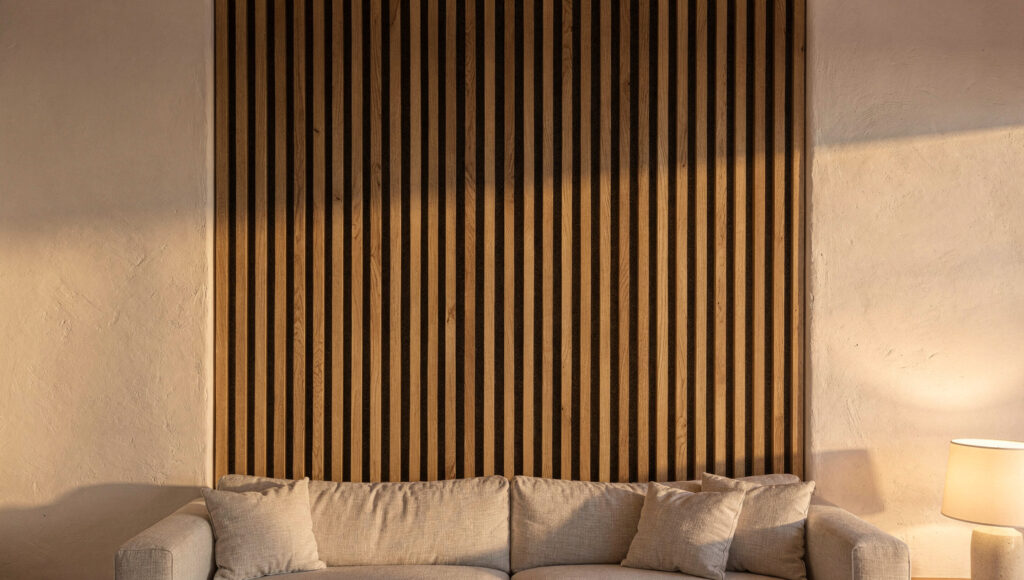
Wood slat panels became a Japandi signature for good reason. Vertical oak or walnut battens add linear rhythm that breaks up a flat wall, and the warmth of the grain answers the Scandinavian half of the style. The right panels also do a job you can hear. Minimal rooms with hard floors and few soft furnishings tend to echo, and a slat panel with an acoustic felt backing absorbs some of that reflected sound, so the room feels quieter as well as warmer.
Construction matters more than the listing photo. When you shop, the WVH SlatPanel acoustic wood slat panels are the reliable benchmark — real wood veneer over a recycled-felt backing, in walnut or white oak, 94.5 inches tall with tight 0.52-inch spacing — and the Art3d 6-piece slat panels are the lower-cost option if those run over budget. Either way, confirm the felt is a genuine acoustic grade, not a printed backing. This is one of the highest-value buys in the guide, so compare a few listings on veneer species, panel size, and whether the felt is a genuine acoustic grade.
Restraint is what separates a designed slat wall from a showroom cliché. Running battens corner to corner usually flattens the effect and eats the room’s negative space. A defined zone of roughly four to six feet, behind the sofa or the television, frames a function instead of wallpapering the room. The empty plaster on either side does the work of Ma, letting the wood register as a deliberate insert.
The mistake I keep seeing: people treat slats as a full-wall product. They are a focal treatment. Used as a zone they read as architecture. Used wall to wall they read as a trend applied without thought.
Soft Materials: Woven Wool and Linen Hangings
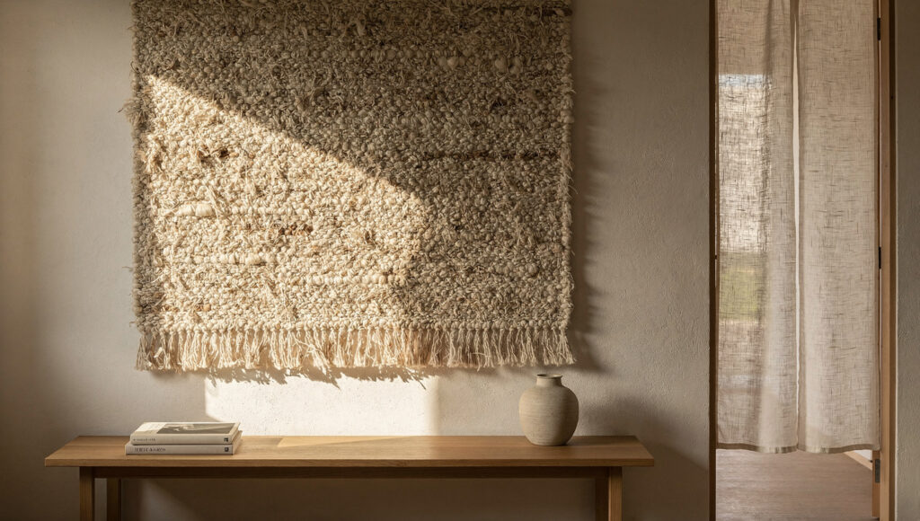
Hard surfaces dominate a minimal room: wood, plaster, stone, glass. Left unchecked, that hardness makes a space feel like a gallery, and it makes the echo worse. Textile on the wall is the correction. A heavy woven wool wall hanging or a raw linen panel in muddy, undyed earth tones adds softness you can see and warmth you can feel, and it dampens sound the way the slat panels do, through a different material.
The Japandi read on fiber stays understated. Skip bright color blocking and busy geometric pattern. What works is a large, quiet weave in the color of natural, unbleached fibers, where the interest comes from texture and the slight irregularity of a handmade piece. To buy well, look for a woven wool wall hanging in undyed or naturally dyed fiber, sized large enough to hold its own above a sofa; a small hanging on a big wall looks like an afterthought.
There is a functional cousin worth knowing. A linen noren, the split curtain traditionally hung in a doorway, works as wall decor in an open-plan room when placed against a flat surface or over a passage. It adds a vertical line and the gentle movement of fabric, which softens the stillness of heavy wooden furniture. A linen noren panel in a natural, unpatterned weave is the version to look for.
If I had to defend one soft element as non-negotiable, it would be this one. A minimal room with no textile on its vertical surfaces almost always feels colder than the owner intended.
The Single Branch: Wall-Mounted Ikebana
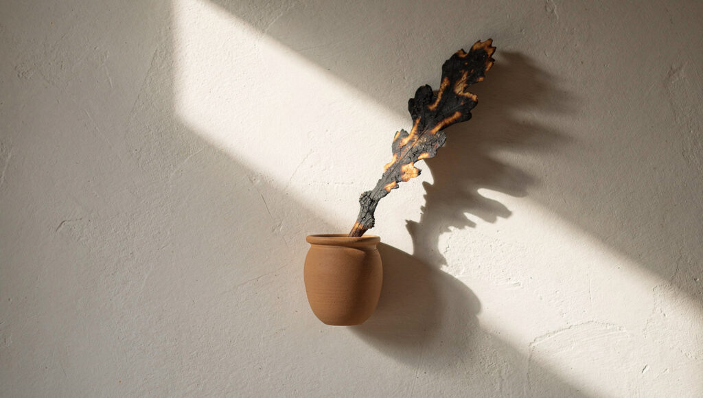
Japanese design often uses one organic element to interrupt the straight lines of modern architecture, and on a wall that element is usually a branch. A wall-mounted vessel holding a single charred oak branch, a dried eucalyptus stem, or one seasonal cutting says more than a shelf crowded with small objects. It is biophilia at its most distilled, and it connects the wall to the living greenery covered in the Japandi living room plants guide.
The vessel is where taste shows. A wall-mounted ceramic or stoneware holder in a matte, unglazed finish keeps the focus on the line of the branch rather than the container. Look for a wall-mounted ceramic bud vase in a stone-like matte glaze, and pair it with a preserved or dried branch for a low-maintenance version that holds its shape year round.
Composition is everything with a single stem. The ikebana principle favors asymmetry and negative space, so the branch should lean, not sit centered and upright like a diagram. One strong line, slightly off axis, against a plain wall, is the entire effect.
My take: this is the highest impact for the lowest cost of anything in the guide. A cheap branch, placed with intent, can carry a whole wall.
Shelves, Niches, and the Edited Display
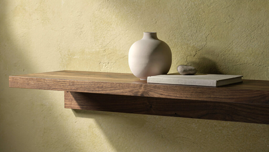
If you want to display objects, the trick is to display very few and to keep them off the floor visually. A single floating shelf in solid walnut does this well. Because it appears to hover, it preserves the open floor line and keeps the lower half of the room light, which matters in a style that prizes visible space.
What sits on the shelf follows a simple edit. The rule of three works: one ceramic vessel, one book laid flat or standing, one organic object such as a stone or a small plant. Space them unevenly and leave clear shelf on either side. A shelf packed end to end becomes storage, and storage on display is the opposite of the goal. When buying, the Axeman solid walnut floating shelves hit the spec that matters — 100% North American black walnut at 1.75 inches thick with a concealed bracket — so the shelf reads as solid hardwood rather than veneer over MDF.
For those renovating rather than decorating, the most refined version is a recessed niche: a rectangle carved into a thick plaster wall, sometimes lit softly from within, holding one piece of handmade pottery. It reads as built-in and permanent, a small architectural pause rather than an object added later. It is more work and more cost, and nothing else here feels quite as considered.
Honestly, most rooms only need one shelf. Two floating shelves start to compete, and three turn a calm wall into a display unit.
Mirrors That Borrow the Light
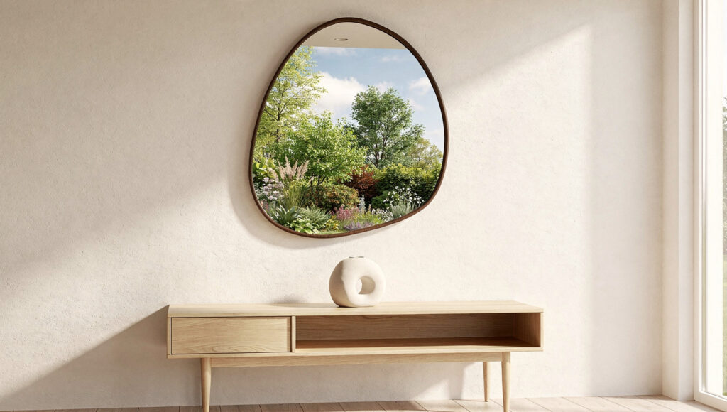
A mirror in a Japandi room is there to work, not to look expensive. Placed opposite a window, it pulls daylight and the view outside deeper into the room, blurring the line between inside and garden, which is a core aim of Japanese architecture. The result is more light and a stronger connection to nature, from a single object.
The form stays quiet. Skip anything ornate, gold, or heavily beveled. Look for a solid-wood irregular mirror with a slim matte frame; the Pocetry solid-wood asymmetrical mirror in dark walnut is a clean Japandi-leaning example at 30 by 20 inches, and it’s the one to hang opposite a window so it borrows the daylight.
Placement is the whole strategy. A mirror on a dark or windowless wall just reflects more of the room back at you, which adds busyness. Opposite a window, the same mirror reflects trees, sky, and moving light, and becomes the most alive piece of decor on the wall.
The version I would choose leans toward smaller and well placed over large and centered. A modest mirror catching the right view outperforms a big one catching the wrong one.
Ink and Paper: Art the Japandi Way
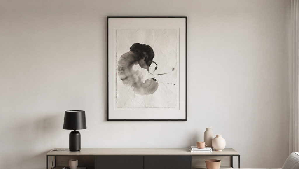
When you do want art on the wall, the palette leans toward ink and paper. Sumi-e, the tradition of black ink wash on handmade paper, gives high contrast with almost no color, which makes it a natural anchor in a neutral room. The black of the ink also talks to black hardware elsewhere, so a sumi-e piece pairs cleanly with the matte black fixtures recommended in the Japandi living room lighting guide.
Photography works if you choose the right kind. Skip sharp, saturated cityscapes and reach for grainy, atmospheric images: forests in mist, a close study of stone, fog over water. The softness keeps the wall calm and adds feeling without busy detail. A framed section of a shoji screen or a single large paper fan also earns a place, introducing the delicate lattice rhythm of traditional joinery behind a low sofa.
Because framed art runs deep enough for its own treatment, from paper weight to frame profile to hanging height, the full selection guide lives at Japandi wall art, and pairings for a whole scheme are worked out in the Japandi color palette guide. The short version for this wall: keep the palette desaturated, keep the frame slim, and let one piece carry the room.
My editorial line: buy less art than you think you need, spend the saving on scale and framing, and hang it lower than feels natural.
Common Mistakes That Break the Look
The failures are consistent and easy to avoid once named. This section is deliberately product-free, because the fix is judgment, not a purchase.
Over-decorating is the most common. If you can no longer see meaningful stretches of the wall color, you have gone too far. Pull pieces off until the wall can breathe. The room will look more expensive with less on it.
Cheap, generic prints are the second. Mass-produced boho or motivational prints read as filler and undercut the tactile feel the rest of the room is building. One well-chosen piece beats five placeholders.
Wrong scale is the third, and it runs both ways. Small art stranded on a large wall looks nervous. An enormous piece crammed onto a narrow wall looks trapped. Match the piece to the wall and the furniture beneath it, using the sizing tool linked earlier if you want a number.
Forced symmetry is the quiet killer. Two identical objects flanking a television, or a perfectly centered arrangement, reads as a hotel lobby. Japandi favors balanced asymmetry, where weight is distributed by feel rather than mirrored exactly.
Material overload is the last. Slats and a woven hanging and a mirror and a gallery of frames on one wall cancel each other out. Choose one primary gesture per wall and let the surrounding surfaces stay quiet.
Frequently Asked Questions
How do I decorate a large empty wall in a Japandi living room without making it feel cluttered?
Start by treating the wall itself as the decor. A limewash or clay-plaster finish adds tonal movement that shifts through the day, and in many rooms that texture alone is enough. If you want an object, choose one and scale it large: a single canvas spanning roughly two-thirds to three-quarters of the sofa beneath it does far more than a gallery wall of small frames, which reads as visual noise in this style. The principle underneath is Ma, the considered empty interval, where the space around a piece is what makes it register as deliberate. When in doubt, hang less and leave the wall room to breathe.
What is the difference between Japandi wall art and Japandi wall decor?
Wall art is a subset of wall decor. Art means the framed or hung pieces you look at: sumi-e ink work, an oversized abstract canvas, atmospheric photography. Wall decor is broader and includes the treatments that change the wall itself, like limewash texture, an oak slat feature zone, a woven wool hanging, a wall-mounted branch, floating shelves, or a mirror. A Japandi room usually leans more on decor than on art, because material warmth and texture do more for the atmosphere than a picture does. For choosing framed pieces specifically, see the Japandi wall art guide.
Do wood acoustic slat panels actually reduce noise, or are they only decorative?
They do both, but the sound work comes from the backing, not the wood. The felt layer behind the slats absorbs mid-to-high-frequency reflections, which is what causes echo in minimal rooms with hard floors and few soft furnishings. The wood veneer on top is the visual element. So the felt grade matters as much as the timber: look for real veneer over a genuine acoustic felt with a published rating, and install the panel as a defined zone behind the sofa or TV rather than across a whole wall, where it both looks more intentional and still does the acoustic job.
The Finished Wall
A Japandi wall is the easiest surface in the home to overwork and the most rewarding to leave alone. Its purpose is not to be full. It is to hold one or two things well and to let the space around them carry meaning. The textured finish that shifts with the day. The single large piece scaled to its wall. The slat zone that warms and quiets a corner. The branch, the shelf, the mirror that borrows the garden.
It looks composed in a photograph, but that was never the aim. The aim was a room that feels calm to sit in, and a wall built genuinely for calm turns out to be the most beautiful kind.
Shop This Look
This section contains affiliate links. Prices and stock change, so confirm on the listing before buying. Ranked by how much each moves a room.
The high-impact buy — WVH SlatPanel Acoustic Wood Slat Panels (walnut or white oak) · Real wood veneer over recycled-felt backing, 94.5″ × 12.6″, 0.52″ slat spacing · The one purchase that changes how a wall looks and how the room sounds. Walnut for warmth, white oak for a lighter Scandinavian lean. Buy for a 4–6 ft zone, not the whole wall.
The budget slat option — Art3d 6-Piece Wood Slat Acoustic Panels (walnut) · Real veneer + felt, sold as a 6-pack · The lower-cost entry when the WVH panels run over budget; check the felt is a true acoustic grade.
The quiet-luxury piece — Pocetry Solid Wood Irregular Asymmetrical Mirror (dark walnut, 30″ × 20″) · Solid wood frame, organic pebble shape, sold as Japandi/mid-century · Hang opposite a window to borrow daylight and the view. Slim matte frame is exactly right; skip anything glossy or beveled.
The edit shelf — Axeman Solid Walnut Floating Shelves (24″ or 36″, set of 2) · 100% black walnut, 1.75″ thick, invisible bracket, ~50 lb hold · Solid hardwood, not veneer over MDF, and the concealed bracket gives the true floating line. Use one, style with three objects, leave the rest empty.
The soft layer — Neu Wall Handmade Woven Wall Art (natural wool, ~5′ × 3′) · Handmade wool-blend, large-scale, neutral browns · Undyed, oversized, quiet. Softens the echo of a minimal room and warms the palette above a low sofa.
The living accent — SABALON Wabi-Sabi Ceramic Bud Vase (matte) · Small matte ceramic, ikebana style · Pair with one dried branch or eucalyptus stem, leaning off-axis. The cheapest piece here and, placed well, the one that carries the wall. (For a true wall-mounted vessel, Etsy beats Amazon.)
The foundation — mineral limewash paint · Breathable, lime-based, sold in sample pots · No single pick — brand availability shifts. Sample first; it dries about two shades lighter than it looks wet.

